


Forecasting - Data Science - ثاني ثانوي
1. Introduction to Data Science


2. Data Collection and Validation
3. Exploratory Data Analysis
4. Predictive data modeling and forecasting
1. Introduction to Data Science
2. Data Collection and Validation
3. Exploratory Data Analysis
4. Predictive data modeling and forecasting
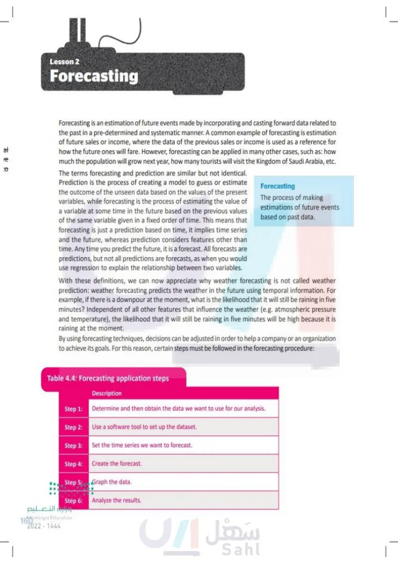
Lesson 2 Forecasting Link to digital lesson www.ien.edu.sa Forecasting Forecasting is an estimation of future events made by incorporating and casting forward data related to the past in a pre-determined and systematic manner. A common example of forecasting is estimation of future sales or income, where the data of the previous sales or income is used as a reference for how the future ones will fare. However, forecasting can be applied in many other cases, such as: how much the population will grow next year, how many tourists will visit the Kingdom of Saudi Arabia, etc. The terms forecasting and prediction are similar but not identical. Prediction is the process of creating a model to guess or estimate the outcome of the unseen data based on the values of the present variables, while forecasting is the process of estimating the value of a variable at some time in the future based on the previous values of the same variable given in a fixed order of time. This means that forecasting is just a prediction based on time, it implies time series and the future, whereas prediction considers features other than time. Any time you predict the future, it is a forecast. All forecasts are predictions, but not all predictions are forecasts, as when you would use regression to explain the relationship between two variables. The process of making estimations of future events based on past data. With these definitions, we can now appreciate why weather forecasting is not called weather prediction: weather forecasting predicts the weather in the future using temporal information. For example, if there is a downpour at the moment, what is the likelihood that it will still be raining in five minutes? Independent of all other features that influence the weather (e.g. atmospheric pressure and temperature), the likelihood that it will still be raining in five minutes will be high because it is raining at the moment. By using forecasting techniques, decisions can be adjusted in order to help a company or an organization to achieve its goals. For this reason, certain steps must be followed in the forecasting procedure: Table 4.4: Forecasting application steps التعليم Description Step 1: Determine and then obtain the data we want to use for our analysis. Step 2: Use a software tool to set up the dataset. Step 3: Set the time series we want to forecast. Step 4: Create the forecast. Step 5: Graph the data. Step 6: Analyze the results. Ministry of Education 160 2024-1446

Forecasting
Forecasting application steps
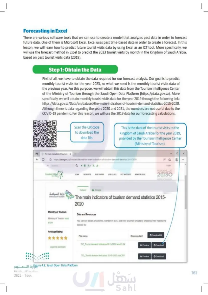
Forecasting in Excel There are various software tools that we can use to create a model that analyzes past data in order to forecast future data. One of them is Microsoft Excel. With Excel we can use past time-based data in order to create a forecast. In this lesson, we will learn how to predict future tourist visits data by using Excel as an ICT tool. More specifically, we will use the forecast method in Excel to predict the 2023 tourist visits by month in the Kingdom of Saudi Arabia, based on past tourist visits data (2019). Step 1: Obtain the Data First of all, we have to obtain the data required for our forecast analysis. Our goal is to predict monthly tourist visits for the year 2023, so what we need is the monthly tourist visits data of the previous year. For this purpose, we will obtain this data from the Tourism Intelligence Center of the Ministry of Tourism through the Open Data Platform (https://open.data.gov.sa). More specifically, we will obtain monthly tourist visits data for the year 2019 through the following link: https://open.data.gov.sa/en/datasets/view/c8a5a2a4-3f02-4a55-a83b-8a633bfcae92/resources Although there is data regarding the years 2020 and 2021, the numbers are not useful due to the COVID-19 pandemic. For this reason, we will use the 2019 data for our forecasting calculations. وزارة التعليم Ministry of Education 2024-1446 Open Data Platform Scan the QR code to download the data file. wps://open.data.gov.se/en/datasets/view/c8a5a204-302-455-836-8633b92/resources OPEN DATA PLATFORM منصة البيانات المفتوحة Platform Datasets Organizations Real-Time API Community This is the data of the tourist visits to the Kingdom of Saudi Arabia for the year 2019, provided by the Tourism Intelligence Center (Ministry of Tourism). The main indicators of tourism demand statistics 2015-2020 Home / Datasets / The main indicators of tourism demand statistics 2015-2020 / Resources Files Dataset Resources Categories CSV TIC Tourist demand indicators 2015-2020 TIC Tourist demand indicators 2015-2020 TIC_Tourist demand indicators 2015-2020 TIC Tourist demand indicators 2015-2020 Figure 4.8: Open Data Platform Login ww 161

Forecasting in Excel
Obtain the Data
Saudi Open Data Platform
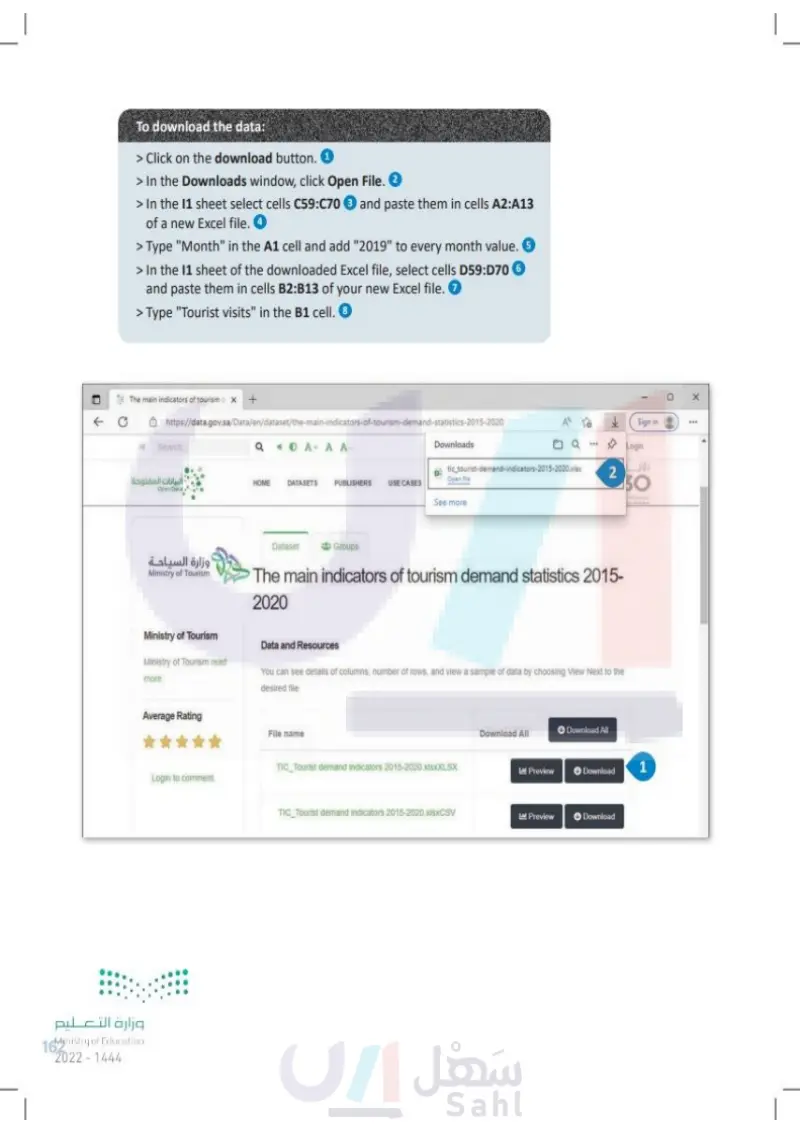
To download the data: > Click on the three dots button ... and then on the Download button that appears. 1 > In the Downloads window, click Open File. 2 > In the 11 sheet select cells C59:C70 3 and paste them in cells A2:A13 of a new Excel file. ④4 > Type "Month" in cell A1 and add "2019" to every month value. 5 > In the 11 sheet of the downloaded Excel file, select cells D59:D70 6 and paste them in cells B2:B13 of your new Excel file. ⑦ > Type "Tourist visits" in cell B1. 8 Open Data Platform https://open.data.gov.sa/env/datasets/view/c8a5a2a-3102-4655-683-8a633bfca92/resources OPEN DATA PLATFORM منصة البيانات المفتوحة Platform Datasets Organizations Real-Time API A Community Downloads TC Tour demand indicator 2015-2020.XLSX Open file 2 See more The main indicators of tourism demand statistics 2015-2020 Home / Datasets / The main indicators of tourism demand statistics 2015-2020 / Resources Dataset Resources 88 Categories Files TIC Tourist demand indicators 2015-2020 CSV وزارة التعليم Ministry of Education 162 2024-1446 TIC Tourist demand indicators 2015-2020 Download TIC Tourist demand indicators 2015-2020 TIC Tourist demand indicators 2015-2020 o 1

To download the data
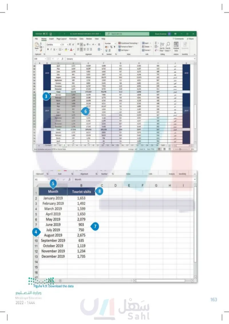
AutoSave Off File tic tourist-demand-indicators-2015-2020 Home Insert Page Layout Formulas Data Review View Search (Alt+Q) Help Binary Academy BA Comments Share Cambria 11 A A Paste BIU Clipboard Font Number % Conditional Formatting Format as Table Insert Σ Delete Cell Styles Format Alignment 15 Number 15 Styles Cells Editing Sort & Find & Filter Select Analyze Samitivity Data Analysis Sensitivity C59 January B D E F G H 49 April 1,511 14,069 5,688 9.3 3,764 404 50 May 1.619 16.287 6.732 10.1 4.157 413 51 June 1,070 9,302 4,462 8.7 4.172 480 2018 2018 52 July 641 3,332 2,657 5.2 4,146 797 8 53 August 2.444 49,562 30,479 20.3 12.473 615 54 September 509 2,720 2.303 5.3 4.521 847 65 October 903 8,850 5,492 9.8 6,082 621 اكتور 56 November 1,141 14,707 7,933 12.9 6,954 539 57 December 1427 17.132 8.753 12.0 6.134 511 Total 15,334 173,929 93,478 11.3 6,096 537 الإجمالي 3 January 1,653 14,339 7,982 8.7 4,828 557 February 1.492 13.385 6,775 9.0 4.541 506 March 1,599 16.688 6.762 10.4 4.228 405 62 April 1,650 15.236 6.211 9.2 3.763 408 63 May 2,079 19,757 10.167 95 4,889 515 44 June 903 98 4,056 76 4.489 588 2019 July 750 6 2019 7 3,363 6.5 4,485 693 August 2.675 342 34,911 19.6 13.053 667 1 67 September 635 4,104 3,145 6.5 4,952 767 68 October 1,119 11,081 5,199 9.9 4.647 469 69 November 1,234 13,247 5,334 10.7 4,322 403 اتور عوفني 70 December 1,735 17.103 9.448 9.9 5.445 552 71 Total 17,526 189,036 103,354 10.8 5,897 547 الإمال 72 January 1.737 16.211 8,806 9.3 5,070 543 73 February 1.483 15,528 8,010 10.5 5.402 516 74 March 192 1.296 796 6.8 4.153 614 75 April 27 71 64 2.6 2.354 902 10 An 10 34 3832 Content G1 G2 11 Select destination and press ENTER or choose Paste 12 13 14 15 16 17 18 D1 D2 D3 D4 FG D5 D6 D7 01 02 03 4 040 04 05 06 Defir *** ④ Average: 1460 Count: 24 Sum: 17526 Styles C D E Clipboard FSA Font Alignment ESP Number A1 fe Month 5 B Month 1 Tourist visits 8 2 January 2019 1,653 3 February 2019 1,492 4 March 2019 1,599 5 April 2019 1,650 6 May 2019 2,079 7 June 2019 903 7 July 2019 750 4 August 2019 2,675 10 September 2019 635 11 October 2019 1,119 12 November 2019 1,234 13 December 2019 1,735 14 15 16 وزارة التعليم Ministry of Education 2024-1446 2019 FL Figure 4.9: Download the data Cells Analysis Sensitivity G H 4 163

Download the data
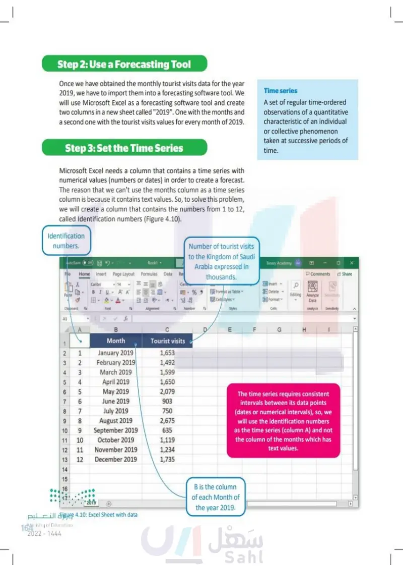
Step 2: Use a Forecasting Tool Once we have obtained the monthly tourist visits data for the year 2019, we have to import them into a forecasting software tool. We will use Microsoft Excel as a forecasting software tool and create two columns in a new sheet called "2019", one with the months and a second one with the tourist visits values for every month of 2019. Step 3: Set the Time Series Microsoft Excel needs a column that contains a time series with numerical values (numbers or dates) in order to create a forecast. The reason that we can't use the months column as a time series column is because it contains text values. So, to solve this problem, we will create a column that contains the numbers from 1 to 12, called identification numbers (Figure 4.10). Time series A set of regular time-ordered observations of a quantitative characteristic of an individual or collective phenomenon taken at successive periods of time. Identification numbers. Number of tourist visits AutoSave Off Fle Book1 to the Kingdom of Saudi Arabia expressed in Binary Academy BA Home Insert Page Layout Formulas Data Re Comments Share thousands. Calibri <14 Gene Insert a BIU A AE Paste 3 % 9 898 Format as Table Cell/Styles Delete Format Editing Analyze Sensitivity Data Clipboard A1 A E B Font 19 Alignment Number Styles Cells Analysis Sensitivity fx ןד F G H C E Month 1 Tourist visits 4 5 6 7 8 6 1234 23 5678 January 2019 February 2019 March 2019 1,653 1,492 1,599 April 2019 1,650 May 2019 2,079 June 2019 903 July 2019 750 August 2019 2,675 10 9 September 2019 635 11 10 October 2019 1,119 12 11 November 2019 1,234 13 12 December 2019 1,735 14 15 16 B is the column 17 2019 التعليم Figure 4.10: Excel spreadsheet with data Ministry of Education 164 2024-1446 The time series requires consistent intervals between its data points (dates or numerical intervals), so we will use the identification numbers as the time series (column A) and not the column of the months which has text values. for each Month of the year 2019.

Use a Forecasting Tool
Set the Time Series
Identification numbers
Time series
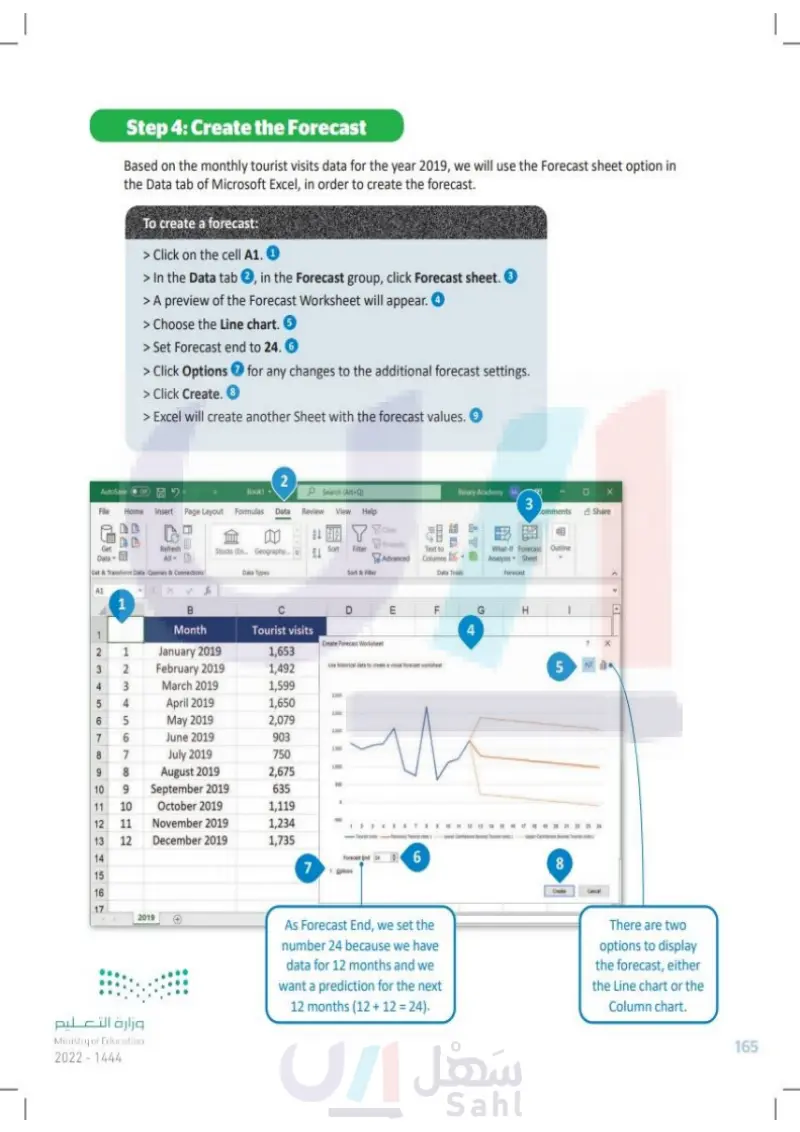
Step 4: Create the Forecast Based on the monthly tourist visits data for the year 2019, we will use the Forecast sheet option in the Data tab of Microsoft Excel in order to create the forecast. To create a forecast: > Click on cell A1. 1 > In the Data tab 2, in the Forecast group, click Forecast sheet. 3 > A preview of the Forecast Worksheet will appear. 4 > Choose the Line chart. 5 > Set Forecast end to 24. 6 > Click Options 7 for any changes to the additional forecast settings. > Click Create. 8 > Excel will create another sheet with the forecast values. 9 AutoSave Off 2 Book1 Search (Alt+Q) File Home Insert Page Layout Formulas Data Review View Help Get Datav目 Refresh All Get & Transform Data Queries & Connections A1 1 Binary Academy EA 3 omments Share 乳ㄤ Clear Sort Filter Stocks (En... Geography... Heapply Advanced Text to Columns E Data Types Sort & Filter Data Tools What-If Forecast Outline Analysis Sheet Forecast F G 4 H B D E LL Month Tourist visits 1 Create Forecast Worksheet 2 3 12 1 January 2019 1,653 2 February 2019 1,492 Use historical data to create a visual f visual forecast worksheet 4 3 March 2019 1,599 1.000 5 4 April 2019 1,650 1500 6 7 8 567 May 2019 2,079 2.000 June 2019 903 1.500 July 2019 750 9 8 August 2019 1000 2,675 10 9 September 2019 100 635 11 12 123 10 October 2019 1,119 11 November 2019 500 1,234 12 December 2019 1,735 Teuntests Forecast Tout shit) 14 Forecast End 24 6 7 Dotions 15 16 17 2019 وزارة التعليم Ministry of Education 2024-1446 5 7 18 19 20 21 22 23 24 Under Confidence found Tourists) 8 Create Cancel As Forecast End, we set the number 24 because we have data for 12 months and we want a prediction for the next 12 months (12+12= 24). There are two options to display the forecast, either the line chart or the column chart. 165

Create the Forecast
To create a forecast
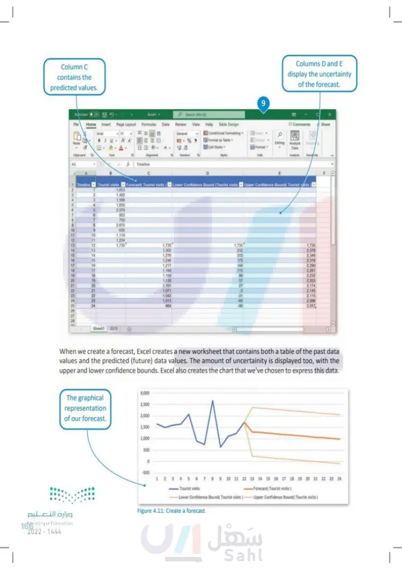
Column C contains the predicted values. 9 AutoSave Off Book1 Search (Alt+Q) File Home Insert Page Layout Formulas Data Review View Help Table Design Arial BIU 11 General A A % Paste 000 .000 Conditional Formatting Format as Table Cell Styles Insert Delete Format Clipboard Font Alignment Number FS Styles Cells fx Timeline Columns D and E display the uncertainty of the forecast. E Comments Share Editing Analyze Sensity Data Analysis Sensivity E 1 Timeline Tourist visits Forecast( Tourist visits Lower Confidence Bound (Tourist visits Upper Confidence Bound( Tourist visits 1 1,653 3 1,492 4 3 1,599 5 1,650 6 5 2,079 7 903 8 7 750 9 8 2,675 10 9 635 11 10 1,119 12 11 1,234 13 12 1,735 1,735 1.735 1,735 14 13 1,305 232 2,378 15 14 1,276 203 2,349 16 15 1,246 173 2,319 17 16 1,217 144 2,290 18 17 1,188 115 2,261 19 18 1,159 86 2,232 21 222222222 20 19 1,130 57 2,203 20 1,101 27 2,174 21 1,071 -2 2,145 23 22 1,042 -31 2,115 24 22 23 1,013 -60 2,086 24 984 -90 2,057 26 27 28 Sheet1 2019 4 When we create a forecast, Excel creates a new worksheet that contains both a table of the past data values and the predicted (future) data values. The amount of uncertainity is displayed too, with the upper and lower confidence bounds. Excel also creates the chart that we've chosen to express this data. 3,000 The graphical 2,500 representation of our forecast. 2,000 1,500 1,000 وزارة التعليم Ministry of Education 166 2024-1446 500 0 -500 1 2 3 4 5 6 7 8 9 10 11 12 13 14 15 16 17 18 19 20 21 22 23 24 Tourist visits Forecast( Tourist visits) -Lower Confidence Bound( Tourist visits)- Upper Confidence Bound(Tourist visits) Figure 4.11: Create a forecast

Column C contains the predicted values
When we create a forecast, Excel creates a new worksheet that contains both a table of the past data values and the predicted (future) data values
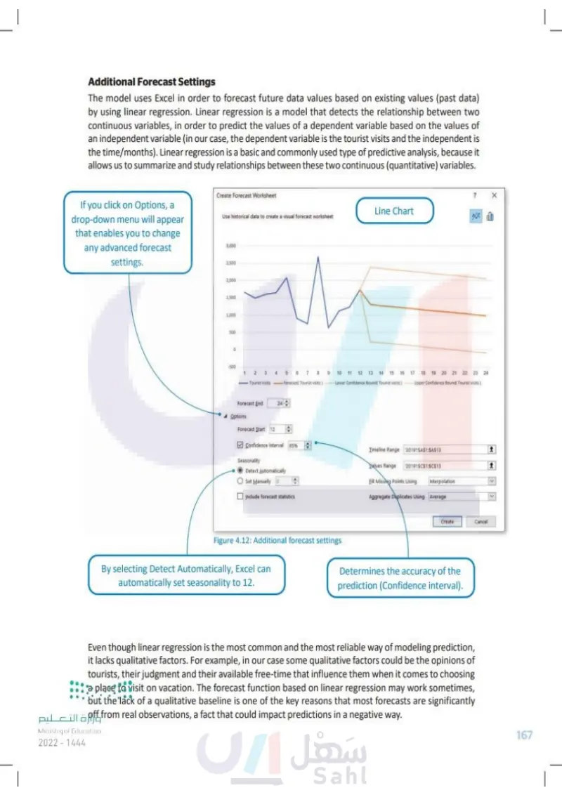
Additional Forecast Settings The model uses Excel in order to forecast future data values based on existing values (past data) by using linear regression. Linear regression is a model that detects the relationship between two continuous variables, in order to predict the values of a dependent variable based on the values of an independent variable (in our case, the dependent variable is the tourist visits and the independent variable is the time/months). Linear regression is a basic and commonly used type of predictive analysis, because it allows us to summarize and study relationships between these two continuous (quantitative) variables. If you click on Options, a drop-down menu will appear that enables you to change any advanced forecast settings. Create Forecast Worksheet Line Chart Use historical data to create a visual forecast worksheet 3,000 2,500 2,000 1,500 1,000 500 -500 3 4 5 6 7 8 9 10 11 12 13 14 15 16 17 18 19 20 21 22 23 24 -Tourist visits Forecast Tourist visits) Lower Confidence Bound Tourist visits) Upper Confidence Bound Tourist visits) Forecast End 24 Options Forecast Start 12 Confidence interval 95% Seasonality Detect Automatically Set Manually 0 Include forecast statistics Timeline Range 2019!SA$1:SAS13 1 alues Range 2019SC$1:$C$13 Fill Missing Points Using Interpolation Aggregate Duplicates Using Average く Create Cancel Figure 4.12: Additional forecast settings By selecting Detect Automatically, Excel can automatically set seasonality to 12. Determines the accuracy of the prediction (Confidence interval). Even though linear regression is the most common and the most reliable way of modeling prediction, it lacks qualitative factors. For example, in our case some qualitative factors could be the opinions of tourists, their judgment and their available free-time, which influence them when it comes to ⚫choosing a place to visit on vacation. The forecast function based on linear regression may work sometimes, but the lack of a qualitative baseline is one of the key reasons that most forecasts deviate pill significantly from real observations, a fact that could impact predictions in a negative way. Ministry of Education 2024-1446 167

Line Chart
Additional Forecast Settings
Even though linear regression is the most common and the most reliable way of modeling prediction
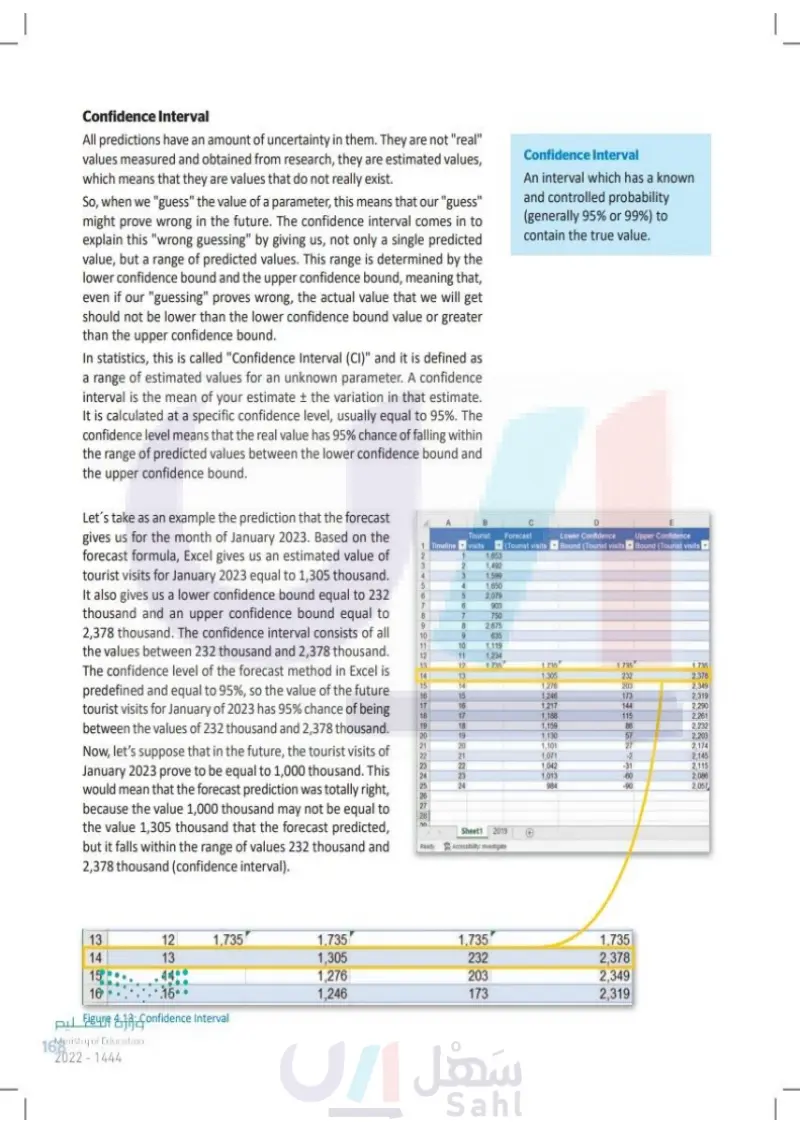
Confidence Interval All predictions have an amount of uncertainty in them. They are not "real" values measured and obtained from research, they are estimated values, which means that they are values that do not really exist. So, when we "guess" the value of a parameter, this means that our "guess" might prove wrong in the future. The confidence interval comes in to explain this "wrong guessing" by giving us, not only a single predicted value, but a range of predicted values. This range is determined by the lower confidence bound and the upper confidence bound, meaning that, even if our "guessing" proves wrong, the actual value that we will get should not be lower than the lower confidence bound value or greater than the upper confidence bound. In statistics, this is called the "Confidence Interval (CI)" and it is defined as a range of estimated values for an unknown parameter. A confidence interval is the mean of your estimate ± the variation in that estimate. It is calculated at a specific confidence level, usually equal to 95%. The confidence level means that the real value has 95% chance of falling within the range of predicted values between the lower confidence bound and the upper confidence bound. Let's take as an example the prediction that the forecast gives us for the month of January 2023. Based on the forecast formula, Excel gives us an estimated value of tourist visits for January 2023 equal to 1,305,000. It also gives us a lower confidence bound equal to 232 thousands of visits and an upper confidence bound equal to 2,378 thousands of visits. The confidence interval consists of all the values between 232 and 2,378 thousands of visits. The confidence level of the forecast method in Excel is predefined and equal to 95%, so the value of the future tourist visits for January of 2023 has 95% chance of being between the values of 232 and 2,378 thousands of visits. Now, let's suppose that in the future, the tourist visits of January 2023 prove to be equal to 1,000 thousands of visits. This would mean that the forecast prediction was correct, because the value 1,000 may not be equal to the value 1,305 that the forecast predicted, but it falls within the range of values 232 and 2,378 (confidence interval). 123 Confidence Interval An interval which has a known and controlled probability (generally 95% or 99%) of containing the true value. Timeline B Tourist visits E Forecast (Tourist visits Lower Confidence Bound (Tourist visits Upper Confidence Bound (Tourist visits 1,653 2 1,492 4 3 1,599 5 4 1,650 6 5 2,079 7 6 903 8 7 750 9 8 2,675 10 9 635 11 10 1,119 12 11 1,234 13 12 1.735 1.735 1.735 1.735 14 13 1,305 232 2.378 15 14 1,276 203 2,349 16 15 1,246 173 2.319 17 16 1,217 144 2,290 18 17 1,188 115 2.261 19 18 1,159 86 2,232 20 19 1,130 57 2,203 21 20 1,101 27 2,174 21 1,071 -2 2,145 23 1,042 -31 2,115 24 23 1,013 -60 2,086 25 24 984 -90 2,057 26 27 28 00 Sheet1 2019 2222222222 2222222 Ready Accessibility: investigate + 13 12 1,735 1,735 1,735 1,735 14 13 1,305 232 2,378 15 14 1,276 203 2,349 16 15 1,246 173 2,319 وزارة التعليم Figure 4.13: Confidence Interval 168 Ministry of Education 2024-1446

Confidence Interval
Step 5: Graph the Data As mentioned before, the forecast can be displayed in two different charts, the line chart or the column chart: Line Chart Line charts are commonly used to display change over time as a series of data points connected by straight lines. The line chart helps to determine the relationship between two sets of values (for example the set of values for time and the set of values for tourist visits), with one data set always being dependent on the other set (for example, the tourist visits are dependent on time). Benefits of line charts: They allow a quick analysis of data. They allow us to easily observe changes over a certain period of time. They are adequate for data sets with up to 50 data values. They help in making predictions about the results of data not yet recorded. Column Chart Column charts are used for displaying the quantities of data collected through questionnaires and interviews, such as age groups, number of products sold, etc. They can also be used for data such as tourist visits per month, but only if the number of values in the data set is not large. Benefits of column charts: They are great when comparison between data sets is needed. They can summarize a large amount of data in a visual, easily interpretable form. They make trends easier to observe. They help in studying patterns over a long period of time. وزارة التعليم Ministry of Education 2024-1446 169

Graph the Data
Benefits of line charts
Column Chart
Benefits of column charts
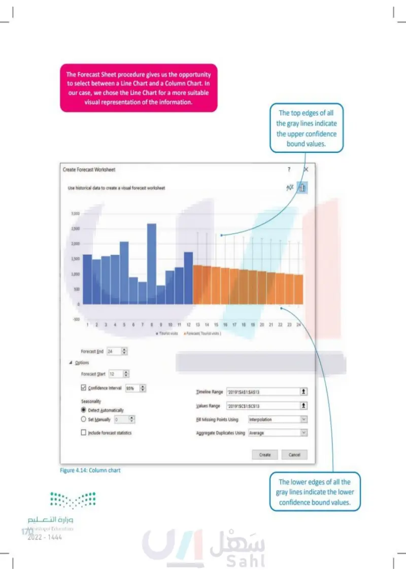
The Forecast Sheet procedure gives us the opportunity to select between a Line Chart and a Column Chart. Create Forecast Worksheet Use historical data to create a visual forecast worksheet 3,000 2,500 2,000 1,500 1,000 500 -500 1 2 3 56789 ■ Tourist visits The top edges of all the gray lines indicate the upper confidence bound values. ? 必备 10 11 12 13 14 15 16 17 18 19 20 21 22 23 24 Forecast(Tourist visits) Forecast End 24 Options Forecast Start 12 Confidence Interval 95% Seasonality Detect Automatically Set Manually 0 Include forecast statistics Timeline Range 2019'!SAS1:SAS13 1 Values Range 2019!SCS1:SC$13 1 Eill Missing Points Using Interpolation Aggregate Duplicates Using Average < وزارة التعليم Ministry of Education 170 2024-1446 Figure 4.14: Column chart Create Cancel The lower edges of all the gray lines indicate the lower confidence bound values.

The Forecast Sheet procedure gives us the opportunity to select between a Line Chart and a Column Chart.
Column chart
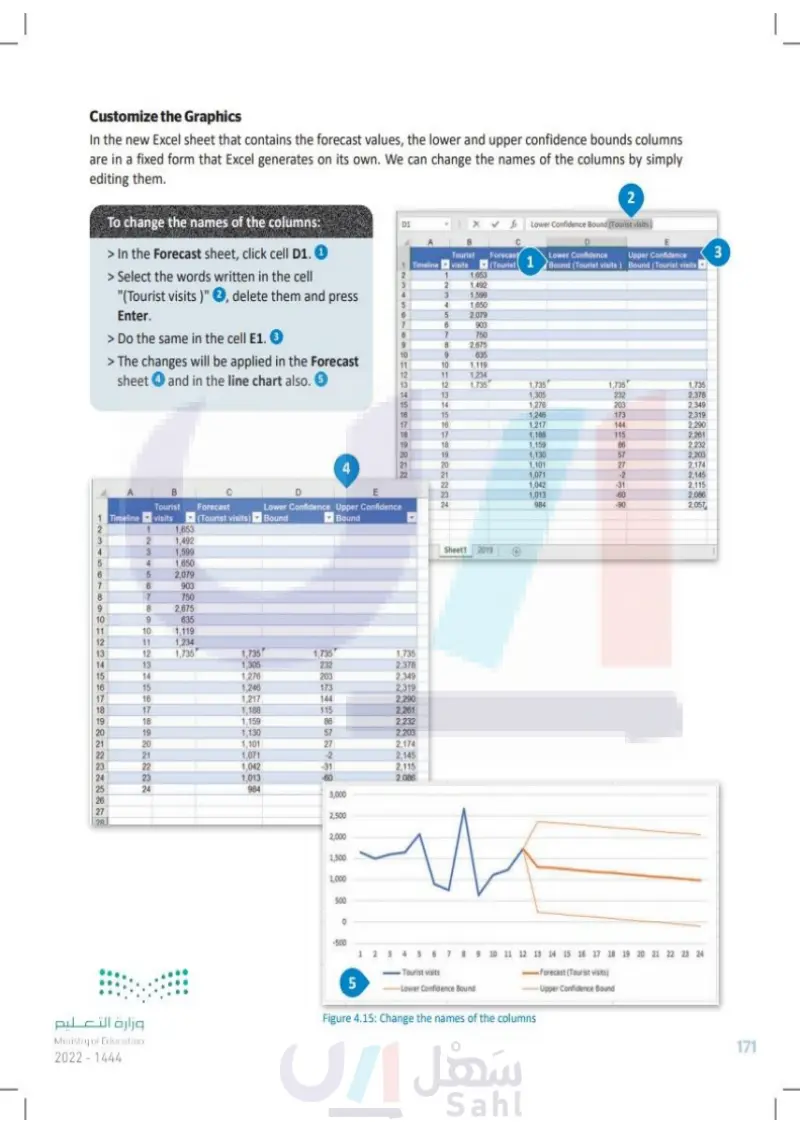
Customize the Graphics In the new Excel spreadsheet that contains the forecast values, the lower and upper confidence bounds columns are in a fixed form that Excel generates on its own. We can change the names of the columns by simply editing them. To change the names of the columns: > In the Forecast sheet, click cell D1. 1 > Select the words written in the cell "(Tourist visits)" 2, delete them and press Enter. > Do the same in cell E1. 3 > The changes will be applied in the Forecast sheet 4 and in the line chart also. 5 4 E 123456 D1 2 fx Lower Confidence Bound (Tourist visits) Tourist Forecast Timeline visits (Tourist 1 Lower Confidence Upper Confidence Bound (Tourist visits) Bound (Tourist visits 3 1 1,653 2 1,492 3 1,599 4 1,650 5 2,079 7 6 903 8 7 750 9 8 2,675 10 9 635 11 10 1,119 12 11 1,234 13 12 1,735 1,735 1,735 1,735 14 13 1,305 232 2,378 PATROA22 15 14 1,276 203 2,349 16 15 1,246 173 2,319 17 16 1,217 144 2,290 18 17 1,188 115 2,261 19 18 1,159 86 2,232 20 19 1,130 57 2.203 21 22222 1,101 27 2,174 1.071 -2 2,145 1,042 -31 2,115 1,013 -60 2,086 984 -90 2,057 B Tourist 123456 1 Timeline visits Forecast (Tourist visits) Lower Confidence Upper Confidence Bound Bound 1,653 2 1,492 1,599 1,650 2,079 903 8 7 750 9 8 2,675 10 9 635 11 10 1,119 12 11 1,234 13 12 1,735 1,735 1,735 1,735 14 13 1,305 232 2,378 15 14 1,276 203 2,349 16 15 1,246 173 2,319 17 16 1,217 144 2,290 18 17 1,188 115 2,261 19 18 1,159 86 2,232 20 21 22 23 24 222222 25 222222 19 1,130 57 2,203 20 1,101 27 2,174 21 1,071 -2 2,145 1,042 -31 2,115 23 1,013 -60 2.086 24 984 3,000 2,500 2,000 1,500 1,000 وزارة التعليم Ministry of Education 2024-1446 500 -500 5 Sheet1 2019 + 1 2 3 4 5 6 7 8 9 10 11 12 13 14 15 16 17 18 19 20 21 22 23 24 - Tourist visits Lower Confidence Bound Forecast (Tourist visits) Upper Confidence Bound Figure 4.15: Change the names of the columns 171

Customize the Graphics
To change the names of the columns
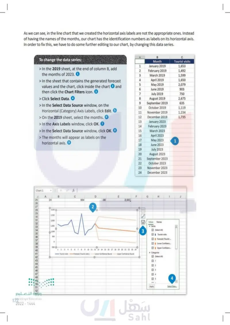
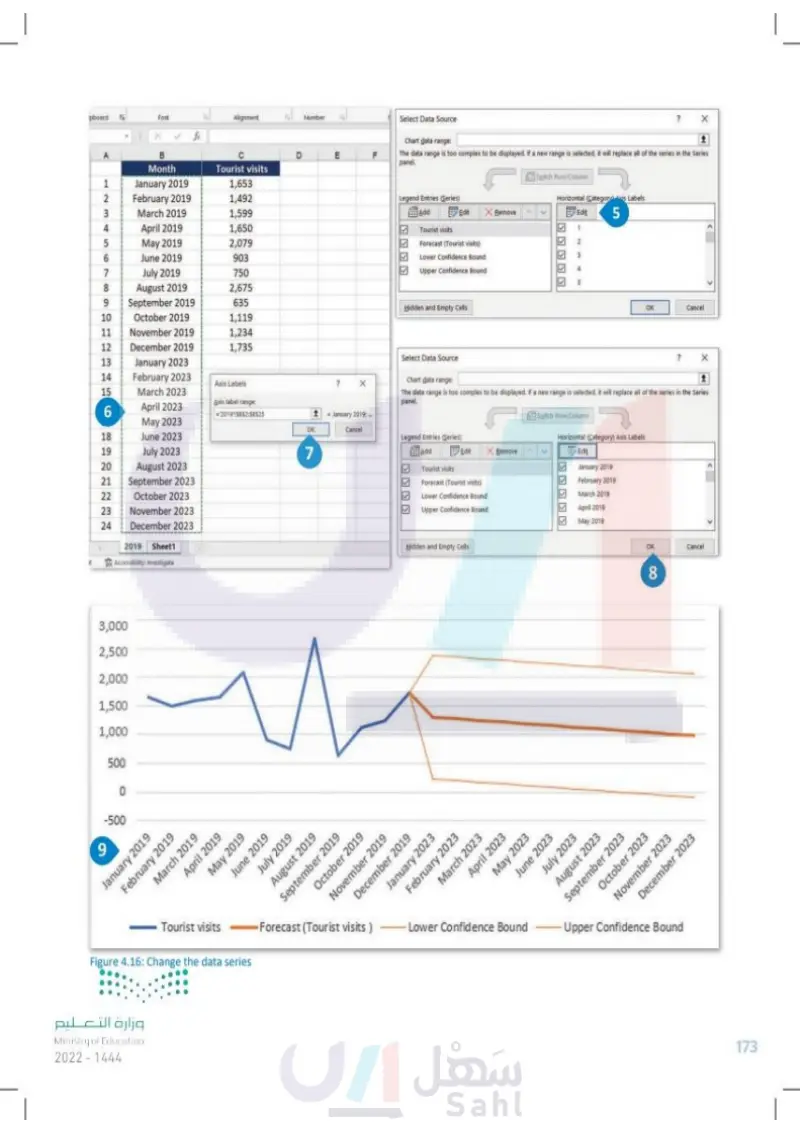
As we can see, in the line chart that we created the horizontal axis labels are not appropriate. Instead of having the names of the months, our chart has the identification numbers as labels on its horizontal axis. In order to fix this, we have to do some further editing to our chart, by changing this data series. To change the data series: > In the 2019 sheet, at the end of column B, add the months of 2023. 1 > In the sheet that contains the generated forecast values and the chart, click inside the chart ② and then click the Chart Filters icon. 3 > Click Select Data. ④ > In the Select Data Source window, on the Horizontal (Category) Axis Labels, click Edit. 5 > On the 2019 sheet, select the months. 6 > In the Axis Labels window, click OK. ⑦ > In the Select Data Source window, click OK. 8 > The months will appear as labels on the horizontal axis. 9 Chart 1 A B 2222 25 24 26 27 28 3,000 O 29 2,500 30 31 2,000 32 1,500 33 34 1,000 35 36 500 37 38 39 -500 O I 40 41 42 43 44 45 46 48 49 50 51 وزارة التعليم Ministry of Education 172 2024-1446 C 984 2 D -90 ய E 2,057 B Month Tourist visits 1234 1 January 2019 1,653 2 February 2019 1,492 March 2019 1,599 4 April 2019 1,650 5 May 2019 2,079 6 June 2019 903 7 July 2019 750 8 August 2019 2,675 9 September 2019 635 10 October 2019 1,119 11 November 2019 1,234 12 December 2019 1,735 13 January 2023 14 February 2023 15 March 2023 16 April 2023 17 May 2023 1 18 June 2023 19 July 2023 20 August 2023 21 September 2023 22 October 2023 23 November 2023 24 December 2023 וד. F G H J 45 Tourist visits 6 7 8 9 10 11 12 13 14 15 16 17 18 19 20 21 22 23 24 Forecast (Tourist visits) Lower Confidence Bound Upper Confidence Bound 3 Values Series Names (Select All) Tourist visits Forecast (Tourist... Lower Confidenc... Upper Confidenc... Categories (Select All) ✓ 3 ] Apply 4 Select Data E

As we can see, in the line chart that we created the horizontal axis labels are not the appropriate ones
To change the data series
pboard Font Alignment Number fx A B D E F Month Select Data Source Chart data range: The data range is too complex to be displayed. If a new range is selected, it will replace all of the series in the Series panel. Tourist visits Switch Row/Column 1234 January 2019 1,653 2 February 2019 1,492 Legend Entries (Series) March 2019 1,599 4 April 2019 1,650 Add Edit Bemove Tourist visits 5 May 2019 2,079 Forecast (Tourist visits) Horizontal (Category avis Labels Edit 5 1 2 LO 6 June 2019 903 Lower Confidence Bound B 7 July 2019 750 Upper Confidence Bound 4 S 8 August 2019 2,675 9 September 2019 635 Hidden and Empty Cells OK Cancel 10 October 2019 1,119 11 November 2019 1,234 12 December 2019 1,735 13 January 2023 Select Data Source 14 February 2023 Axis Labels 15 March 2023 6 April 2023 Axis label range: 201915852:58525 May 2023 18 June 2023 19 July 2023 OK 7 Cancel January 2019... Chart data range: The data range is too complex to be displayed. If a new range is selected it will replace all of the series in the Series panel. Legend Entries (Series) Switch Row/Column Horizontal (Category) Axis Labels 20 August 2023 21 September 2023 22 October 2023 23 November 2023 24 December 2023 Add Edit Remove Edit Tourist visits January 2019 Forecast (Tourist visits) February 2019 Lower Confidence Bound March 2019 Upper Confidence Bound April 2019 May 2019 2019 Sheet1 Hidden and Empty Cells OK Cancel t Accessibility: Investigate 3,000 2,500 2,000 1,500 1,000 500 9 -500 80 January 2019 February 2019 March 2019 April 2019 May 2019 June 2019 Tourist visits July 2019 August 2019 September 2019 December 2019 October 2019 January 2023 February 2023 November 2019 Forecast (Tourist visits) Figure 4.16: Change the data series March 2023 Lower Confidence Bound April 2023 May 2023 June 2023 July 2023 August 2023 September 2023 October 2023 November 2023 Upper Confidence Bound December 2023 وزارة التعليم Ministry of Education 2024-1446 173

Change the data series
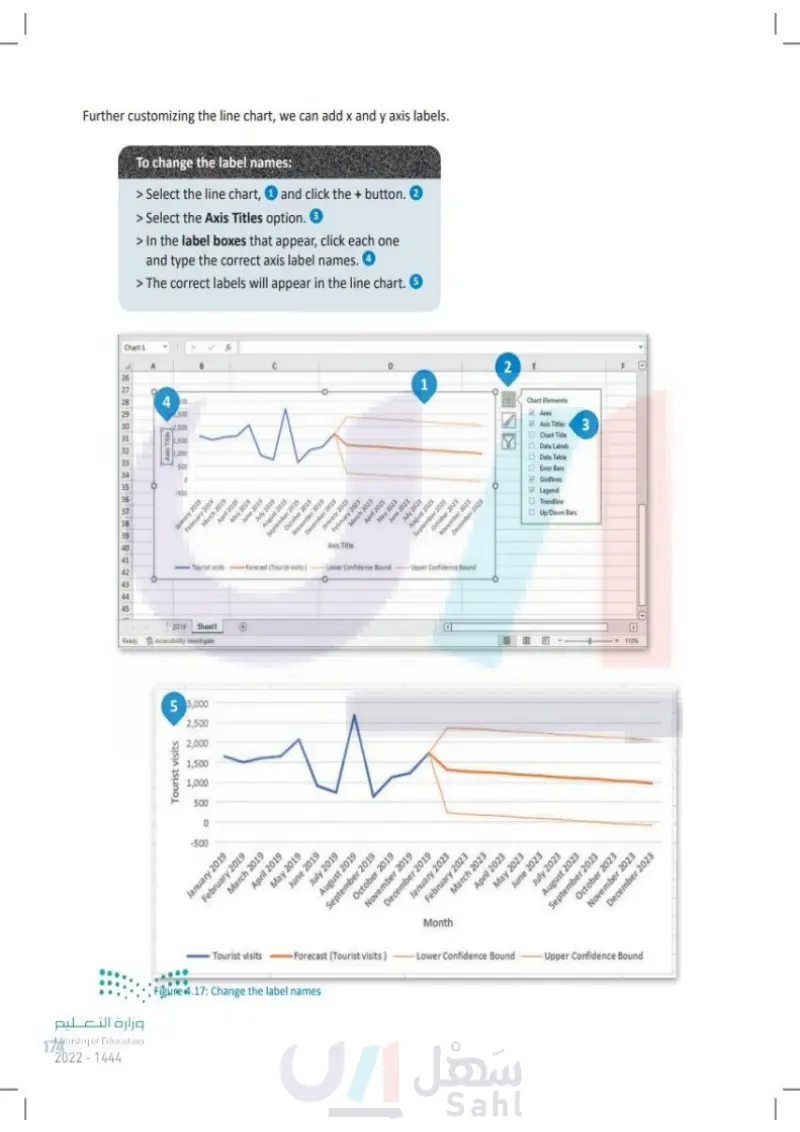
Further customizing the line chart, we can add x and y axis labels. To change the label names: > Select the line chart, ① and click the + button. ② > Select the Axis Titles option. 3 > In the label boxes that appear, click each one and type the correct axis label names. 4 > The correct labels will appear in the line chart. 5 Chart 1 B 26 D 1 27 28 4000 500 29 2,000 30 31 32 Axis Title 1,500 1,000 33 500 34 35 -500 36 37 38 39 40 41 Tourist visits 42 43 44 45 January 2019 February 2019 March 2019 April 2019 May 2019 June 2019 July 2019 August 2019 September 2019 January 2023 February 2023 December 2019 March 2023 October 2019 November 2019 April 2023 Axis Title Forecast (Tourist visits) -Lower Confidence Bound May 2023 June 2023 July 2023 August 2023 September 2023 October 2023 November 2023 December 2023 Upper Confidence Bound 2019 Sheet1 Ready Accessibility: Investigate وزارة التعليم Ministry of Education 174 2024-1446 5 3,000 2,500 2,000 Tourist visits 1,500 1,000 500 0 -500 2 NTC E Chart Elements Axes Axis Titles Chart Title 3 Data Labels Data Table Error Bars Gridlines Legend ☐ Trendline Up/Down Bars E 1109 F June 2023 July 2023 August 2023 September 2023 October 2023 November 2023 December 2023 Tourist visits January 2019 February 2019 March 2019 April 2019 May 2019 Forecast (Tourist visits) June 2019 n July 2019 August 2019 September 2019 October 2019 November 2019 December 2019 Figure 4.17: Change the label names January 2023 February 2023 March 2023 Month Lower Confidence Bound April 2023 May 2023 Upper Confidence Bound

Further customizing the line chart, we can add x and y axis labels
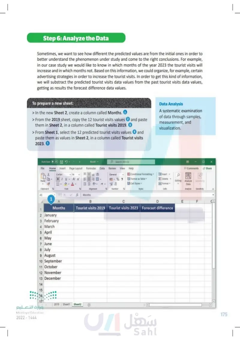
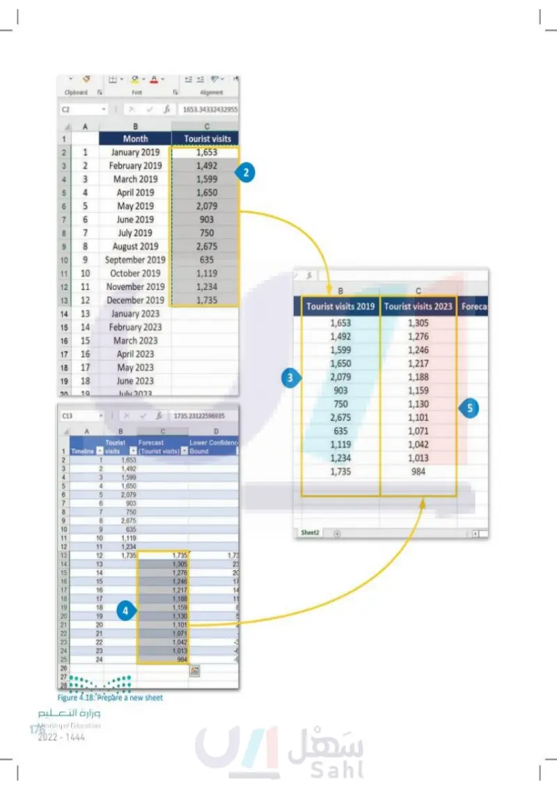
Step 6: Analyze the Data Sometimes, we want to see how different the predicted values are from the initial ones in order to better understand the phenomenon under study and come to the right conclusions. For example, in our case study we would like to know in which months of the year 2023 the tourist visits will increase and in which months not. Based on this information, we could organize, for example, certain advertising strategies in order to increase the tourist visits. In order to get this kind of information, we will substract the predicted tourist visits data values from the past tourist visits data values, getting as results the forecast difference data values. To prepare a new sheet: > In the new Sheet 2, create a column called Months. 1 > From the 2019 sheet, copy the 12 tourist visits values 2 and paste them in Sheet 2, in a column called Tourist visits 2019. 3 > From Sheet 1, select the 12 predicted tourist visits values 4 and paste them as values in Sheet 2, in a column called Tourist visits 2023. 5 Data Analysis A systematic examination of data through samples, measurement, and visualization. AutoSave Off Book1 Search (Alt+Q) File Home Insert Page Layout Formulas Data Review View Help Comments Share Calibri BIU 14 General 3 A A %9 Paste Y A- Conditional Formatting Format as Table Cell Styles Insert Delete Format Editing Analyze Sensitivity Data Clipboard 5 Font Alignment Б Number E Styles Cells Analysis Sensitivity fix Months 1 A Months B C D LI E F Tourist visits 2019 Tourist visits 2023 Forecast difference 1 2 January 3 February 4 March 5 April 6 May 7 June 8 July 9 August 10 September 11 October 12 November 13 December 14 15 16 17 456 وزارة التعليم Ministry of Education 2024-1446 2019 Sheet1 Sheet2 4 175

Analyze the Data
To prepare a new sheet
Data Analysis
To prepare a new sheet
Clipboard Font L C2 fx Alignment 1653.34332432955 A B 1 Month Tourist visits 2 3 45 6 7 8 9 12345678 1 January 2019 1,653 February 2019 1,492 2 March 2019 1,599 4 April 2019 1,650 May 2019 2,079 June 2019 903 7 July 2019 750 August 2019 2,675 10 9 September 2019 635 11 10 October 2019 1,119 fx 12 11 November 2019 1,234 B C 13 12 December 2019 1,735 Tourist visits 2019 Tourist visits 2023 Foreca 14 13 January 2023 15 14 February 2023 1,653 1,305 16 15 March 2023 1,492 1,276 17 16 April 2023 1,599 1,246 18 17 May 2023 1,650 1,217 19 18 June 2023 3 2,079 1,188 20 19 July 2023 903 1,159 750 1,130 5 123456 1 Timeline C13 1735.23122596935 A B D Tourist visits Forecast (Tourist visits) Lower Confidenc Bound 1 1,653 2 1,492 3 1,599 4 1,650 5 2,079 7 6 903 8 7 750 9 8 2,675 10 9 635 11 10 1,119 12 11 1,234 13 12 1,735 1,735 14 13 1,305 1,73 23 15 14 1,276 222 20 16 15 1,246 17 17 16 1,217 14 18 17 1,188 11 19 18 4 1,159 8 20 19 1,130 21 20 1,101 22 21 1,071 222222 23 22 1,042 24 25 22 23 1,013 -6 24 984 -9 26 27 28 2,675 1,101 635 1,071 1,119 1,042 1,234 1,013 1,735 984 Sheet2 Figure 4.18: Prepare a new sheet وزارة التعليم Ministry of Education 176 2024-1446

Prepare a new sheet
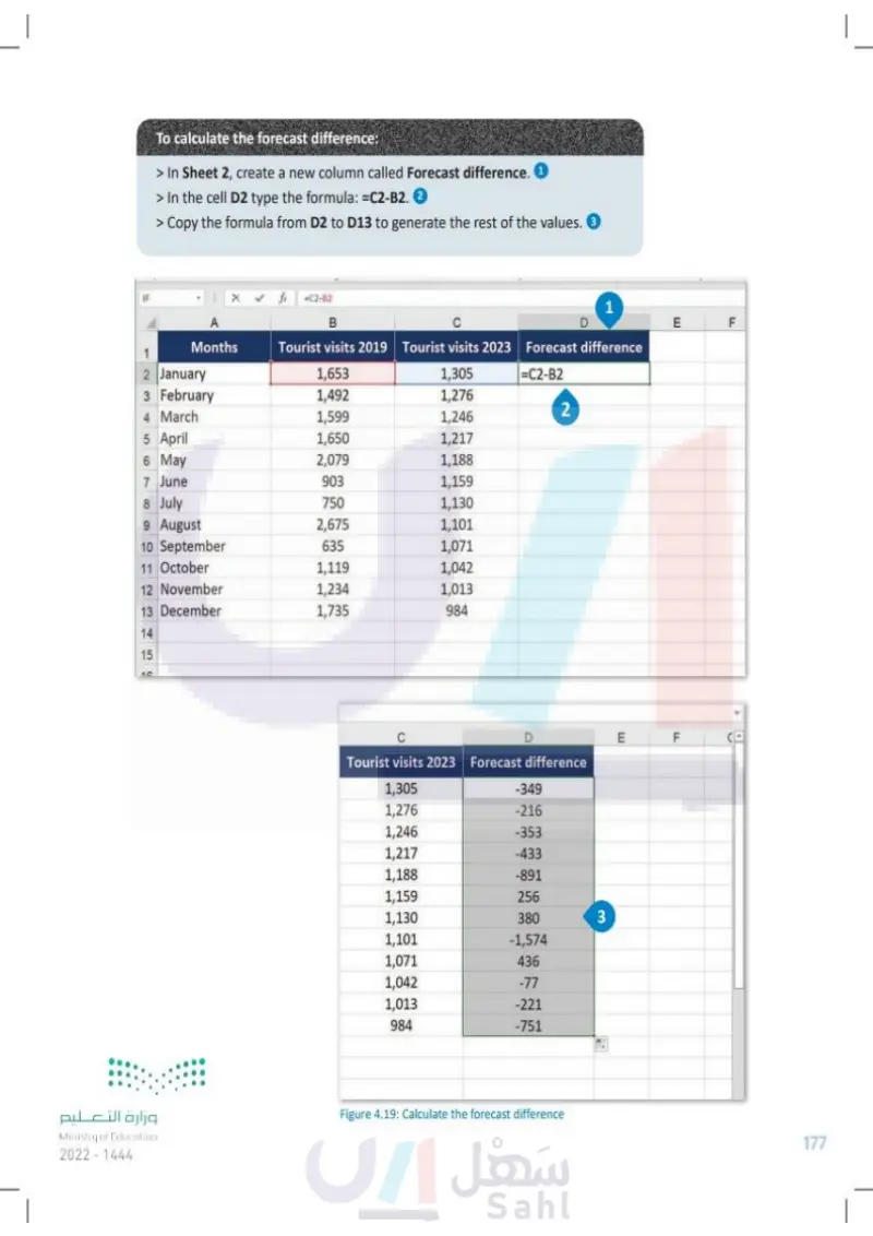
To calculate the forecast difference: > In Sheet 2, create a new column called Forecast difference. 1 > In the cell D2 type the formula: =C2-B2. 2 > Copy the formula from D2 to D13 to generate the rest of the values. 3 IF xx fx =C2-82 A B 1 E Months Tourist visits 2019 Tourist visits 2023 Forecast difference 2 January 1,653 1,305 3 February 1,492 1,276 4 March 1,599 =C2-B2 2 1,246 5 April 1,650 1,217 6 May 2,079 1,188 7 June 903 1,159 8 July 750 1,130 9 August 2,675 1,101 10 September 635 1,071 11 October 1,119 1,042 12 November 1,234 1,013 13 December 1,735 984 14 15 10 وزارة التعليم Ministry of Education 2024-1446 C D Tourist visits 2023 Forecast difference 1,305 -349 1,276 -216 1,246 -353 1,217 -433 1,188 -891 1,159 256 1,130 380 3 1,101 -1,574 1,071 436 1,042 -77 1,013 -221 984 -751 E F Figure 4.19: Calculate the forecast difference LL F 177

To calculate the forecast difference
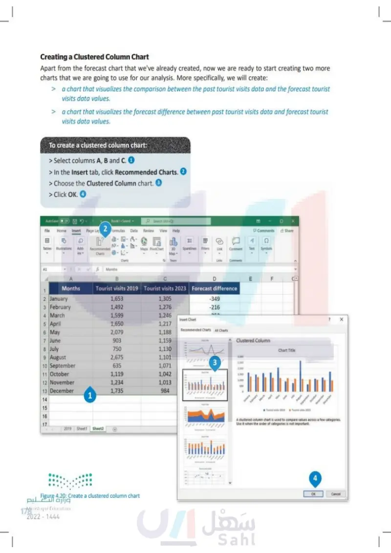
Creating a Clustered Column Chart In addition to the forecast chart that we've already created, now we are ready to start creating two more charts that we are going to use for our analysis. More specifically, we will create: > > a chart that visualizes the comparison between the past tourist visits data and the forecast tourist visits data values. a chart that visualizes the forecast difference between past tourist visits data and forecast tourist visits data values. To create a clustered column chart: > Select columns A, B and C. 1 > In the Insert tab, click Recommended Charts. 2 > Choose the Clustered Column chart. 3 > Click OK. 4 AutoSave Off File Home Insert Book1. Saved Search (Alt+Q) Page Lay 2 Formulas Data Review View Help D Tables Illustrations Add- Recommended ins Charts Charts Maps PivotChart Comments Share 4 喝 E 3D Sparklines Filters Map Link Comment Text Symbols Б Tours Links Comments A1 fx Months A Months B D E F Tourist visits 2019 Tourist visits 2023 Forecast difference 1 2 January 1,653 1,305 -349 3 February 1,492 1,276 -216 4 March 1,599 1,246 717 Insert Chart 5 April 1,650 1,217 6 May 2,079 1,188 Recommended Charts All Charts 7 June 903 1,159 Clustered Column 8 July 750 1,130 Chart Title 9 August 2,675 1,101 3,000 3 2,500 10 September 635 1,071 2,000 11 October 1,119 1,042 1,500 1,000 12 November 1,234 1,013 500 13 December 1,735 984 D 1 14 15 January February March ptember 16 17 Tourist visits 2019 Tourist visits 2023 A clustered column chart is used to compare values across a few categories. Use it when the order of categories is not important. October November December 2019 Sheet1 Sheet2 pulcïll äFigure 4.20: Create a clustered column chart Ministry of Education 178 2024-1446 4+ OK Cancel

Creating a Clustered Column Chart
To create a clustered column chart
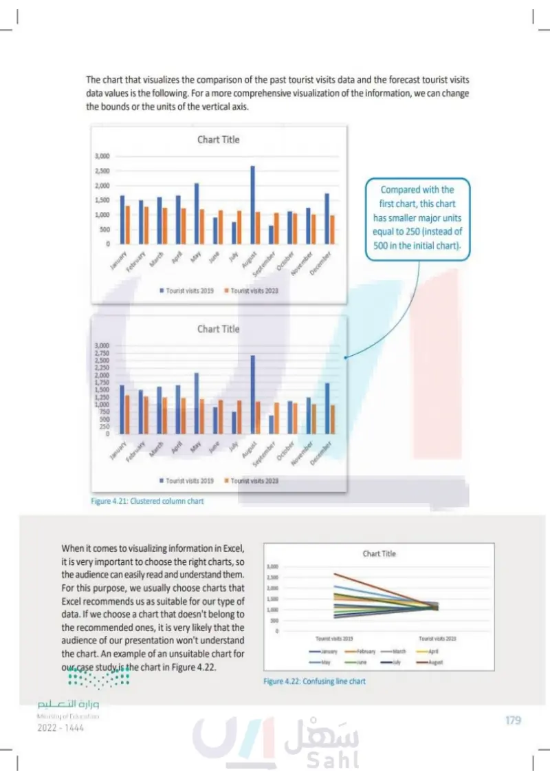
3,000 2,750 2,500 2,250 2,000 1,750 1,500 1,250 1,000 750 500 250 0 The chart that visualizes the comparison of the past tourist visits data and the forecast tourist visits data values is shown below. For a more comprehensive visualization of the information, we can change the bounds or the units of the vertical axis. 3,000 2,500 2,000 1,500 1,000 500 0 January February March Chart Title April May Tourist visits 2019 June July August January February March April May Chart Title September Tourist visits 2023 October November June July ■Tourist visits 2019 Tourist visits 2023 Figure 4.21: Clustered column chart August September October November December When it comes to visualizing information in Excel, it is very important to choose the right charts, so the audience can easily read and understand them. For this purpose, we usually choose charts that Excel recommends us as suitable for our type of data. If we choose a chart that doesn't belong to the recommended ones, it is very likely that the audience of our presentation won't understand the chart. An example of an unsuitable chart for our case study is the chart in Figure 4.22. وزارة التعليم Ministry of Education 2024-1446 December Compared with the first chart, this chart has smaller major units equal to 250 (instead of 500 in the initial chart). Chart Title 3,000 2,500 2,000 1,500 1,000 500 0 Tourist visits 2019 Tourist visits 2023 January -May -February -June March July April August Figure 4.22: Confusing line chart 179

Confusing line chart
Clustered column chart
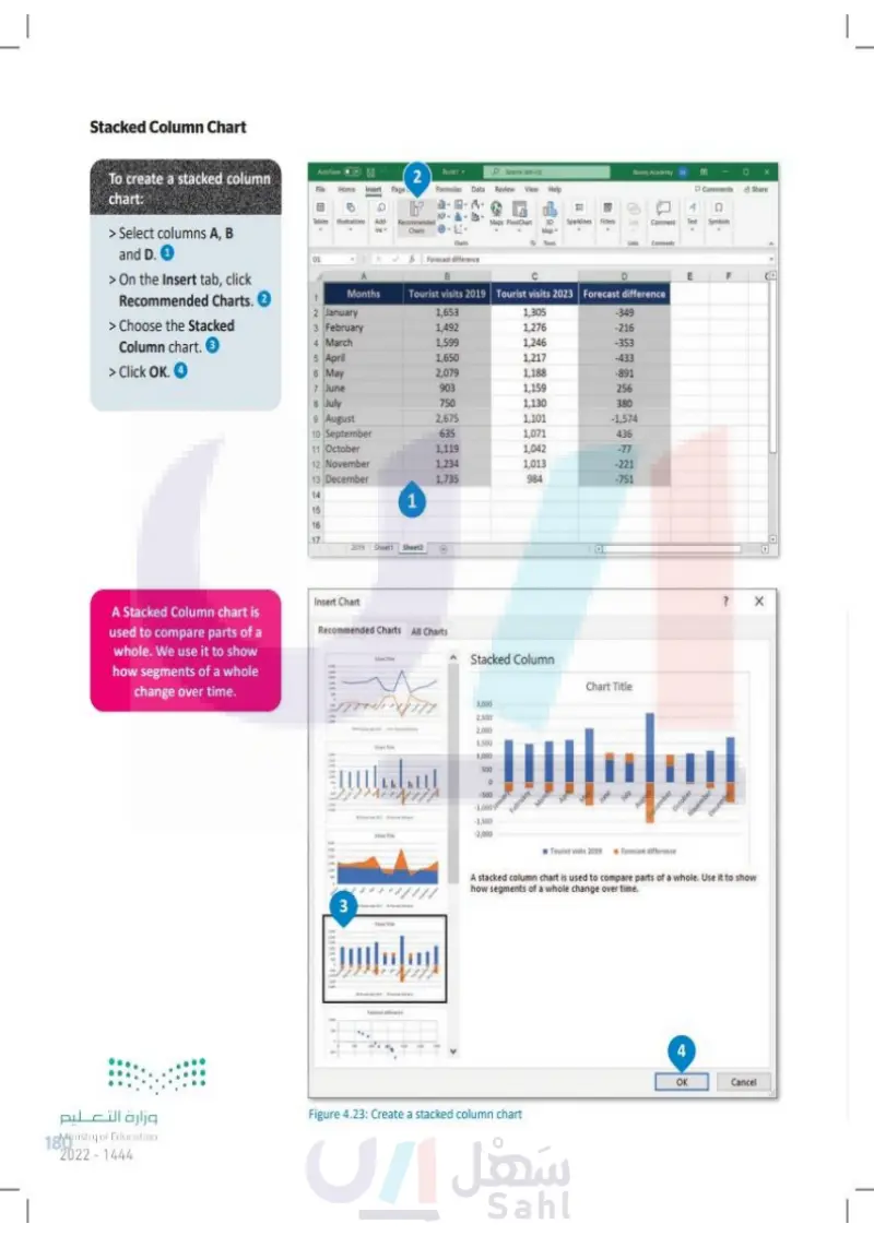
وزارة التعليم Ministry of Education 180 2024-1446 Stacked Column Chart To create a stacked column chart: > Select columns A, B and D. 1 > On the Insert tab, click Recommended Charts. 2 > Choose the Stacked Column chart. 3 > Click OK. 4 AutoSave File Home Insert Page Book! 2 L h? Tables Illustrations Add- Recommended Charts 2 January 3 February O Search (Alt+Q) Formulas Data Review View Help Charts Binary Academy B Comments Share 4 Q 14- 喝 甘 Maps PivotChart 3D Sparklines Filters Lank Comment Text Symbols Map Tours Links Comments Forecast difference Months B Tourist visits 2019 D Tourist visits 2023 Forecast difference 1,653 1,305 -349 1,492 1,276 -216 4 March 1,599 1,246 -353 5 April 1,650 1,217 -433 6 May 2,079 1,188 -891 7 June 903 1,159 256 8 July 750 1,130 380 9 August 2,675 1,101 -1,574 10 September 635 1,071 436 11 October 1,119 1,042 -77 12 November 1,234 1,013 -221 13 December 1,735 984 -751 14 15 456N 1 16 17 2019 Sheet Sheet2 F D D A Stacked Column chart is used to compare parts of a whole. We use it to show how segments of a whole change over time. Insert Chart Recommended Charts All Charts Stacked Column 3,000 2,500 2,000 1,500 1,000 500 500 1,000nuary -1.500 February -2,000 March Apri Chart Title June July August September October November December 3 Tourist visits 2019 Forecast difference A stacked column chart is used to compare parts of a whole. Use it to show how segments of a whole change over time. Figure 4.23: Create a stacked column chart 4 OK Cancel ? X

Stacked Column Chart
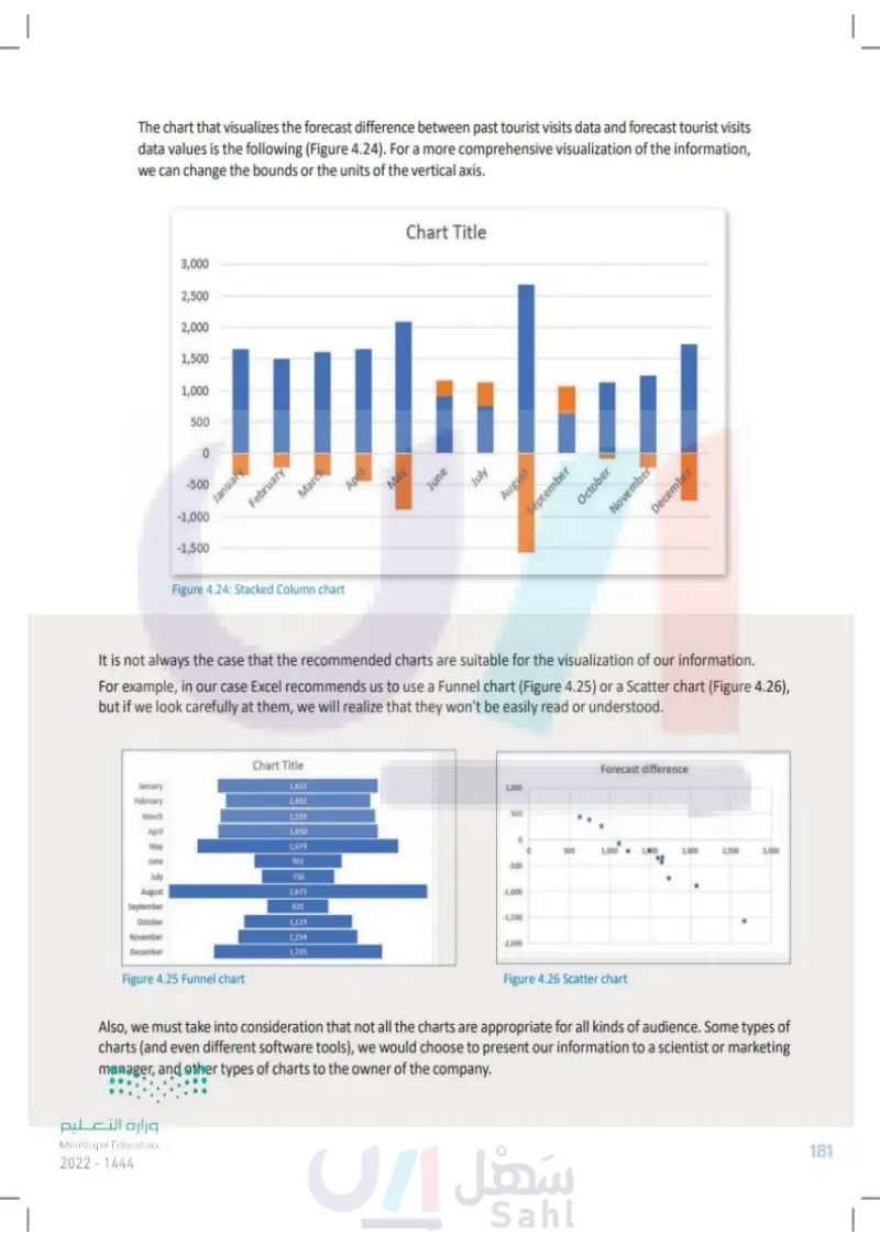
The chart that visualizes the forecast difference between past tourist visits data and forecast tourist visits data values is shown below (Figure 4.24). For a more comprehensive visualization of the information, we can change the bounds or the units of the vertical axis. 3,000 2,500 2,000 1,500 1,000 500 0 -500 -1,000 -1,500 January February March April Chart Title May June July August Figure 4.24: Stacked Column chart September October November December It is not always the case that the recommended charts are suitable for representing of our information. For example, in our case Excel recommends that we use a Funnel chart (Figure 4.25) or a Scatter chart (Figure 4.26), but if we look carefully at them, we will realize that they can't be easily interpreted. Chart Title January February 1,653 1,492 March 1,599 April 1,650 May 2,079 June 903 July 750 August 2,675 September 635 October 1,119 November 1,234 December 1,735 Figure 4.25 Funnel chart Forecast difference 1,000 500 о 0 500 1,000 • 1,000 2,000 2,500 3,000 -500 -1,000 -1,500 -2,000 Figure 4.26 Scatter chart Also, we must take into consideration that not all the charts are appropriate for all kinds of audience. Some types of charts (and even different software tools) may be appropriate for presenting our information to a scientist or marketing manager, but other types may be more appropriate for the owner of the company. وزارة التعليم Ministry of Education 2024-1446 181

The chart that visualizes the comparison of the past tourist visits data and the forecast tourist visits data values is the following
Stacked Column chart
It is not always the case that the recommended charts are suitable for the visualization of our information
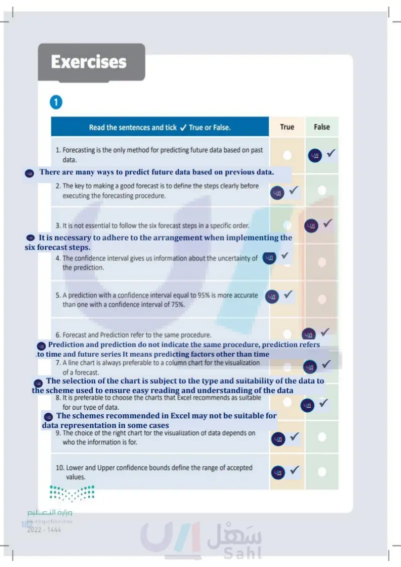
Exercises 1 Read the sentences and tick ✓ True or False. 1. Forecasting is the only method for predicting future data based on past data. 2. The key to making a good forecast is to define the steps clearly before executing the forecasting procedure. 3. It is not essential to follow the six forecast steps in a specific order. 4. The confidence interval gives us information about the uncertainty of the prediction. 5. A prediction with a confidence interval equal to 95% is more accurate than one with a confidence interval of 75%. 6. Forecast and prediction refer to the same procedure. 7. A line chart is always preferable to a column chart for the visualization of a forecast. 8. It is preferable to choose the charts that Excel recommends as suitable for our type of data. 9. The choice of the right chart for the visualization of data depends on who the information is for. 10. Lower and upper confidence bounds define the range of accepted values. وزارة التعليم Ministry of Education 182 2024-1446 True False

Read the sentences and tick True or False. Forecasting is the only method for predicting future data based on past data
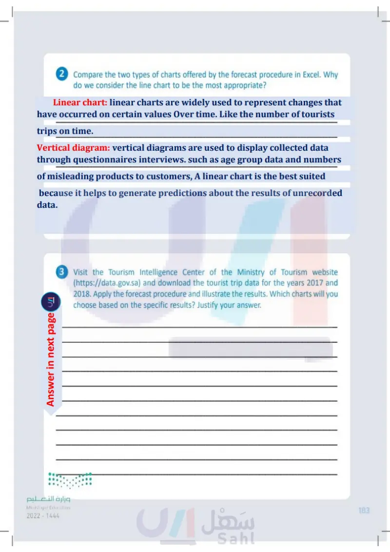
2 Compare the two types of charts offered by the forecast procedure in Excel. Why do we consider the line chart to be the most appropriate? 3 Visit the Tourism Intelligence Center of the Ministry of Tourism website (https://open.data.gov.sa) and download the tourist trip data for the years 2017 and 2018. Apply the forecast procedure and illustrate the results. Which charts will you choose based on the specific results? Justify your answer. وزارة التعليم Ministry of Education 2024-1446 183

Compare the two types of charts offered by the forecast procedure in Excel. Why do we consider the line chart to be the most appropriate
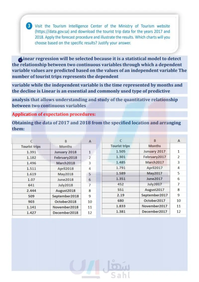
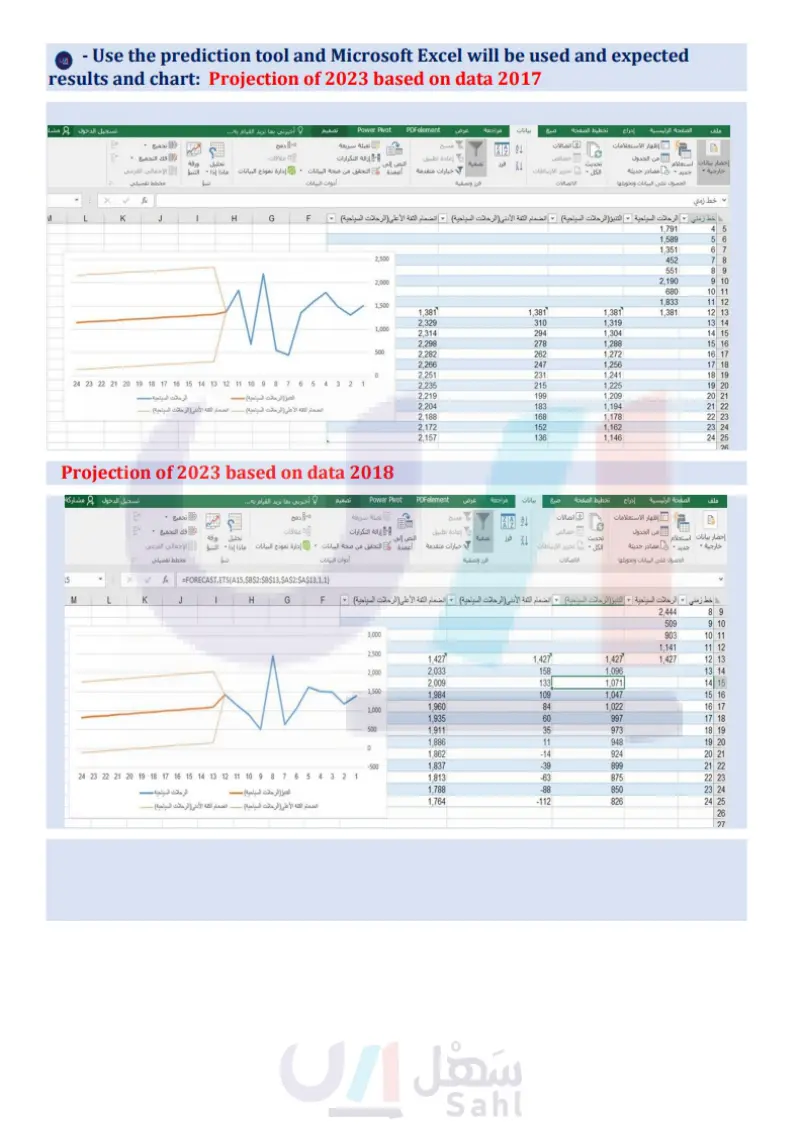
Visit the Tourism Intelligence Center of the Ministry of Tourism website (https://data.gov.sa) and download the tourist trip data for the years 2017 and 2018
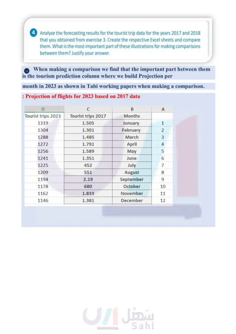
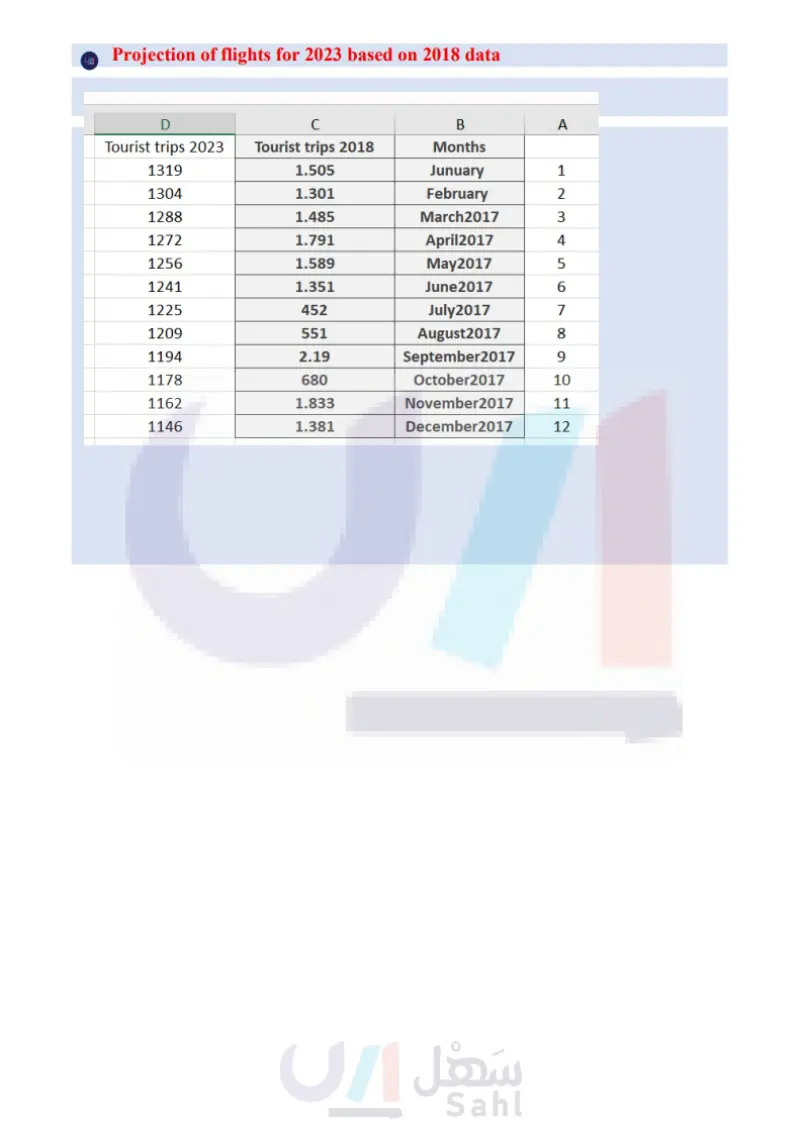
4 Analyze the forecasting results for the tourist trip data for the years 2017 and 2018 that you obtained from exercise 3. Create the respective Excel spreadsheets and compare them. What is the most important part of these illustrations for making comparisons between them? Justify your answer. 5 Using the Excel spreadsheets that you created in exercise 4, make visualizations using all the charts that Excel offers. Which is the most suitable for illustrating this information? Justify your answer. وزارة التعليم Ministry of Education 184 2024-1446

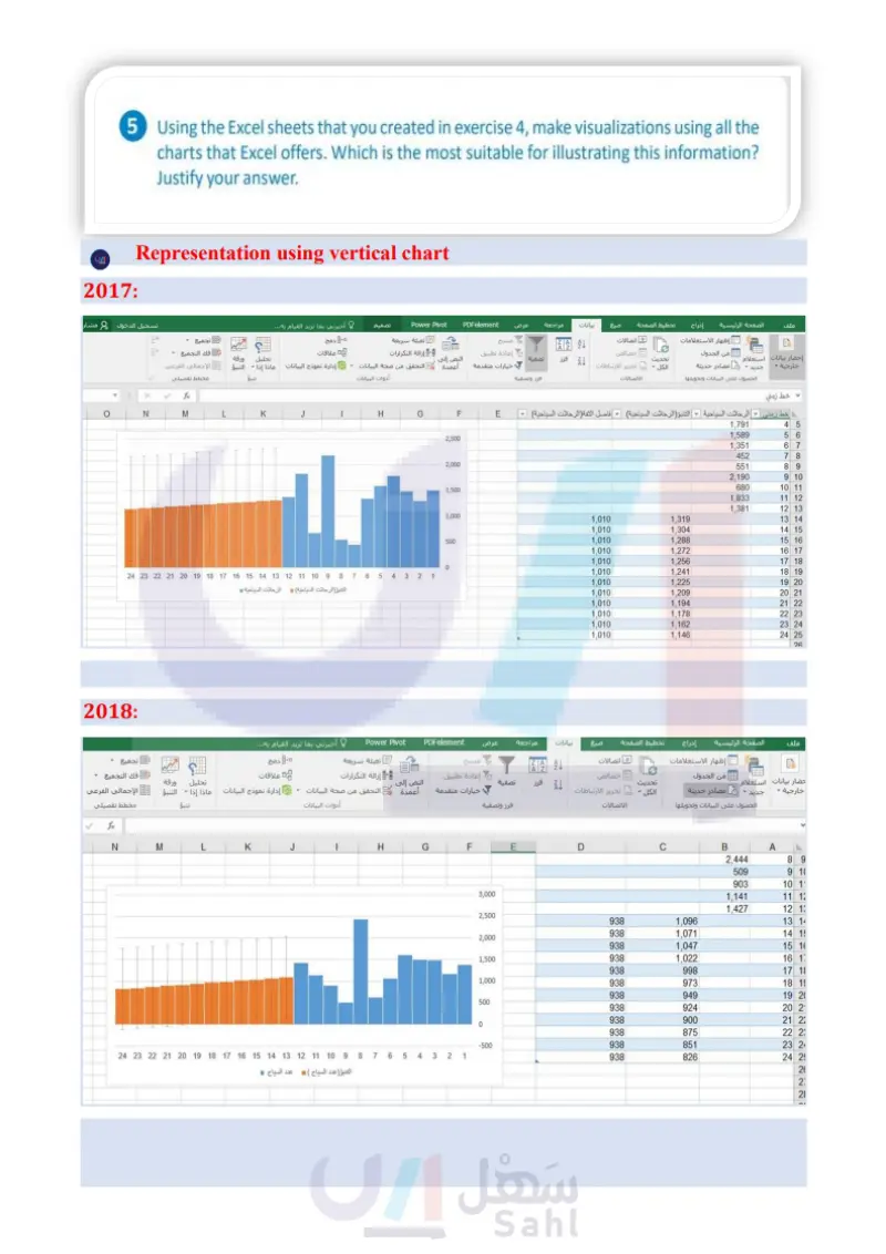
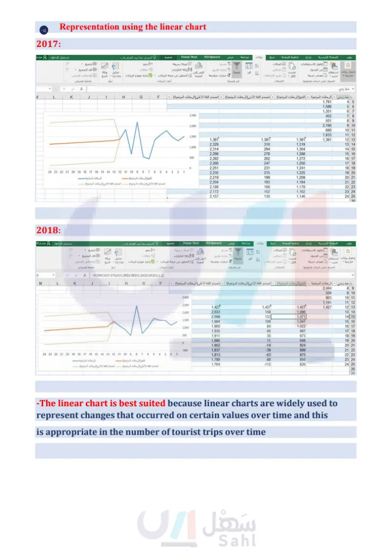
Using the Excel sheets that you created in exercise 4, make visualizations using all the charts that Excel offers. Which is the most suitable for illustrating this information? Justify your
What is the most important part of these illustrations for making comparisons between them? Justify your answer