


Data Visualization - Data Science - ثاني ثانوي
1. Introduction to Data Science


2. Data Collection and Validation
3. Exploratory Data Analysis
4. Predictive data modeling and forecasting
1. Introduction to Data Science
2. Data Collection and Validation
3. Exploratory Data Analysis
4. Predictive data modeling and forecasting
Lesson 3 Data Visualization As we have mentioned before, data visualization is the graphical representation of information and data. Data visualizations make data easier for the human brain to understand and analyze. By using visual elements like charts, graphs, and maps, you make the data more accessible, understandable and usable. In this lesson, you are going to use Jupyter to visualize your data. Jupyter supports data visualization in combination with Python libraries. Types of Data Visualization The most common types of data visualization are: > charts (line chart, bar chart, pie chart) > graphs > plots > histograms > tables > maps Each type of visualization represents the data differently. You should choose the visualization according to what you want to learn from your report. وزارة التعليم Ministry of Education 130 2024-1446 T↓ 2 30 30 40 Figure 3.36: Board showing the most common types of data visualization Link to digital lesson www.ien.edu.sa

Each type of visualization represents the data differently.
Types of Data Visualization
Data Visualization
Board showing the most common types of data visualization
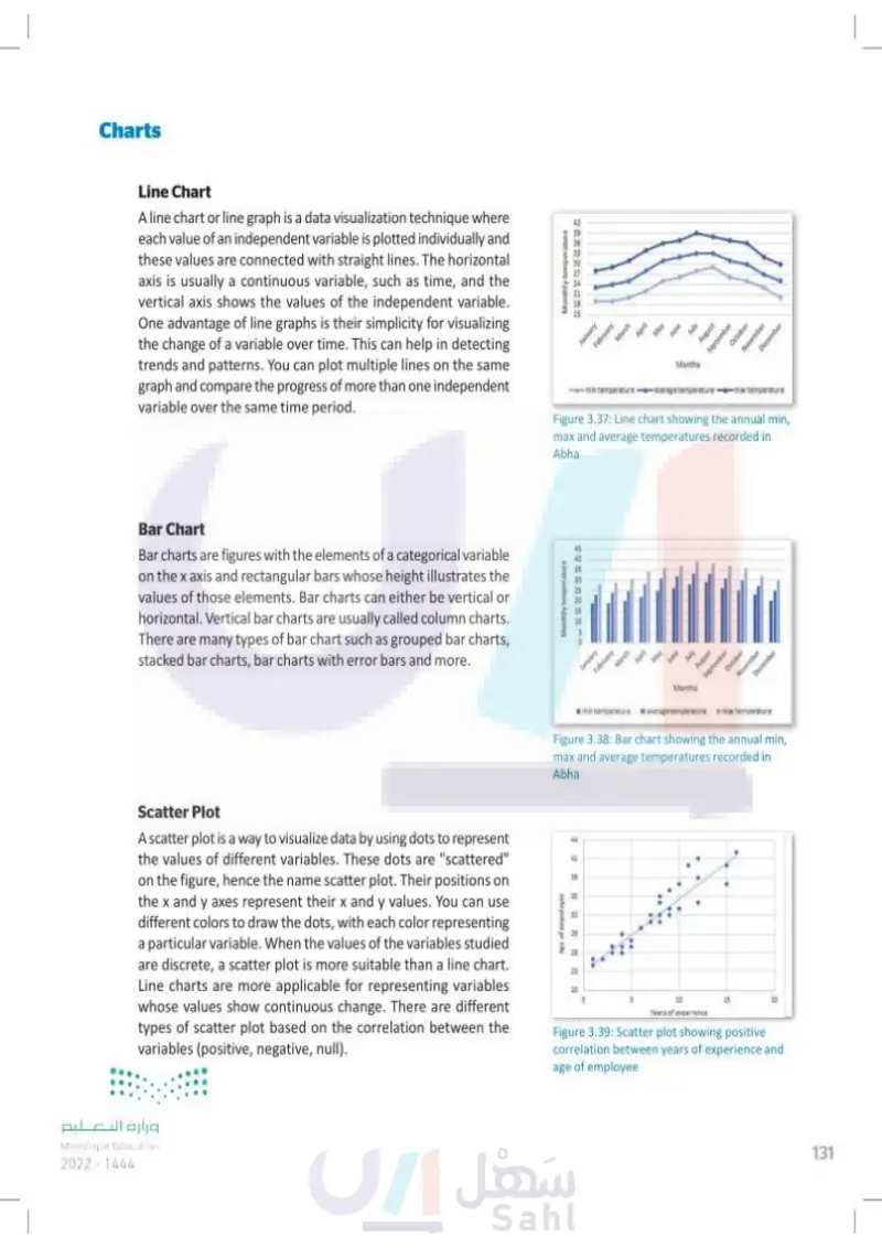
Charts Line Chart A line chart or line graph is a data visualization technique where each value of an independent variable is plotted individually and these values are connected with straight lines. The horizontal axis is usually a continuous variable, such as time, and the vertical axis shows the values of the independent variable. One advantage of line graphs is their simplicity for visualizing the change of a variable over time. This can help in detecting trends and patterns. You can plot multiple lines on the same graph and compare the progress of more than one independent variable over the same time period. Monthly temperature 888 42 89 36 BB 30 27 24 January February March April min temperature May June July August September October November December Months -average temper -max temperature Figure 3.37: Line chart showing the annual min, max and average temperatures recorded in Abha Bar Chart Bar charts are figures with the elements of a categorical variable on the x axis and rectangular bars whose height illustrates the values of those elements. Bar charts can either be vertical or horizontal. Vertical bar charts are usually called column charts. There are many types of bar chart such as grouped bar charts, stacked bar charts, bar charts with error bars and more. Monthly temperature 145 40 35 30 25 20 20 15 January February March April May June July August September October November December I min temperature Months average temperature max temperature Figure 3.38: Bar chart showing the annual min, max and average temperatures recorded in Abha Scatter Plot A scatter plot is a way to visualize data by using dots to represent the values of different variables. These dots are "scattered" on the figure, hence the name scatter plot. Their positions on the x and y axes represent their x and y values. You can use different colors to draw the dots, with each color representing a particular variable. When the values of the variables studied are discrete, a scatter plot is more suitable than a line chart. Line charts are more applicable for representing variables whose values show continuous change. There are different types of scatter plot based on the correlation between the variables (positive, negative, null). Age of employee 44 44 41 38 35 32 29 26 23 20 10 Years of experience 20 Figure 3.39: Scatter plot showing positive correlation between years of experience and age of employee وزارة التعليم Ministry of Education 2024-1446 131

Line Chart
Bar Chart
Scatter Plot
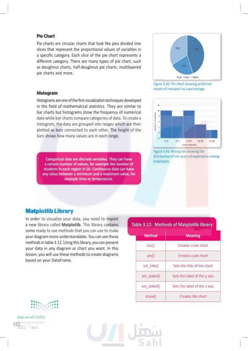
Pie Chart Pie charts are circular charts that look like pies divided into slices that represent the proportional values of variables in a specific category. Each slice of the pie chart represents a different category. There are many types of pie chart, such as doughnut charts, half-doughnut pie charts, multilayered pie charts and more. 33% Histogram Histograms are one of the first visualization techniques developed in the field of mathematical statistics. They are similar to bar charts but histograms show the frequency of numerical data while bar charts compare categories of data. To create a histogram, the data are grouped into ranges which are then plotted as bars connected to each other. The height of the bars shows how many values are in each range. Number of employees 22% 44% car bus metro Figure 3.40: Pie chart showing preferred means of transport as a percentage 12 12 10 [1.4] (4.7 (7.10) (10,13] (13,16] Years of experience Categorical data are discrete variables. They can have a certain number of values, for example the number of students in each region in SA. Continuous data can have any value between a minimum and a maximum value, for example time or temperature. Figure 3.41: Histogram showing the distribution of the years of experience among employees Matplotlib Library In order to visualize your data, you need to import a new library called Matplotlib. This library contains some ready to use methods that you can use to make your diagram more understandable. You can see these methods in table 3.12. Using this library, you can present your data in any diagram or chart you want. In this lesson, you will use these methods to create diagrams based on your DataFrame. Table 3.12: Methods of Matplotlib library Meaning Method bar() Creates a bar chart pie() Creates a pie chart set_title() Sets the title of the chart set_ylabel() set_xlabel() Sets the label of the y axis Sets the label of the x axis show() Displays the chart وزارة التعليم Ministry of Education 132 2024-1446

Table 3.12: Methods of Matplotlib library
Matplotlib Library
Categorical data are discrete variables. They can have a certain number of values, for example the number of students in each region in SA.
Histogram showing the distribution of the years of experience among employees
Pie chart showing preferred means of transport as a percentage
Histogram
Pie Chart
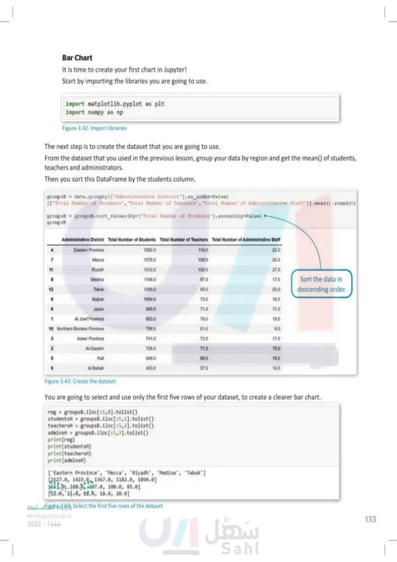
Bar Chart It is time to create your first chart in Jupyter! Start by importing the libraries you are going to use. import matplotlib.pyplot as plt import numpy as np Figure 3.42: Import libraries The next step is to create the dataset that you are going to use. From the dataset that you used in the previous lesson, group your data by region and get the mean() of students, teachers and administrators. Then you sort this DataFrame by the students column. groupsB data.groupby(['Administrative District'], as_index=False) [['Total Number of Students', 'Total Number of Teachers', 'Total Number of Administrative Staff']].mean().round(0) groupsB = groupsB.sort_values (by=['Total Number of Students'], ascending=False) groupsB 1582.0 Administrative District Total Number of Students Total Number of Teachers Total Number of Administrative Staff Eastern Province 110.0 22.0 7 Mecca 1378.0 105.0 20.0 11 Riyadh 1312.0 102.0 27.0 8 Medina 1148.0 97.0 17.0 Sort the data in 12 Tabuk 1088.0 85.0 20.0 descending order. 9 Najran 1054.0 73.0 16.0 6 Jazan 956.0 71.0 17.0 1 Al Jowf Province 953.0 79.0 19.0 10 Northern Borders Province 756.0 61.0 8.0 3 Aseer Province 741.0 72.0 17.0 2 Al-Qassim 708.0 71.0 15.0 5 Hail 648.0 69.0 15.0 Al Bahah 433.0 57.0 10.0 Figure 3.43: Create the dataset You are going to select and use only the first five rows of your dataset to create a clearer bar chart. reg groupsB.iloc[:5,0].tolist() studentsH = groupsB.iloc[:5,1].tolist() teachersH = groupsB.iloc[:5,2].tolist() print(studentsH) adminsH groupsB.iloc[:5,3].tolist() print(reg) print (teachersH) print(adminsH) [Eastern Province', 'Mecca', 'Riyadh', 'Medina', 'Tabuk'] [1627.0, 1419.0, 1367.0, 1182.0, 1094.0] [113.0, 108.0, 107.0, 100.0, 85.0] [22.0, 21.0, 28.0, 18.0, 20.0] وزارة التعليم Ministry of Education 2024-1446 Figure 3.44: Select the first five rows of the dataset 133

Υou are going to select and use only the first five rows of your dataset, to create a clearer bar chart
The next step is to create the dataset that you are going to use
Bar Chart
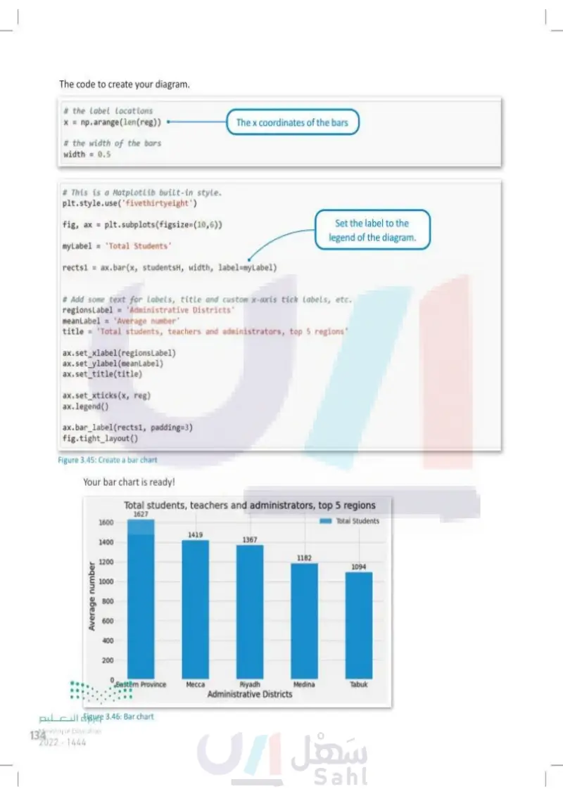
The code to create your diagram. # the Label Locations x = np.arange(len(reg)) # the width of the bars width = 0.5 The x coordinates of the bars # This is a Matplotlib built-in style. plt.style.use('fivethirtyeight') fig, ax = plt.subplots (figsize=(10,6)) myLabel = 'Total Students' rects1 = ax.bar(x, studentsH, width, label=myLabel) Set the label to the legend of the diagram. # Add some text for labels, title and custom x-axis tick labels, etc. regions Label = 'Administrative Districts meanLabel='Average number' title = 'Total students, teachers and administrators, top 5 regions ax.set_xlabel(regions Label) ax.set_ylabel(meanLabel) ax.set_title(title). ax.set_xticks(x, reg) ax. legend() ax.bar_label(rects1, padding=3) fig.tight_layout() Figure 3.45: Create a bar chart Your bar chart is ready! Total students, teachers and administrators, top 5 regions Average number 1600 1400 1200 1000 800 600 400 200 وزارة التعليم Ministry of Education 134 2024-1446 1627 Total Students 1419 1367 1182 1094 Eastern Province Mecca Riyadh Medina Tabuk Administrative Districts Figure 3.46: Bar chart

Your bar chart is ready
The code to create your diagram
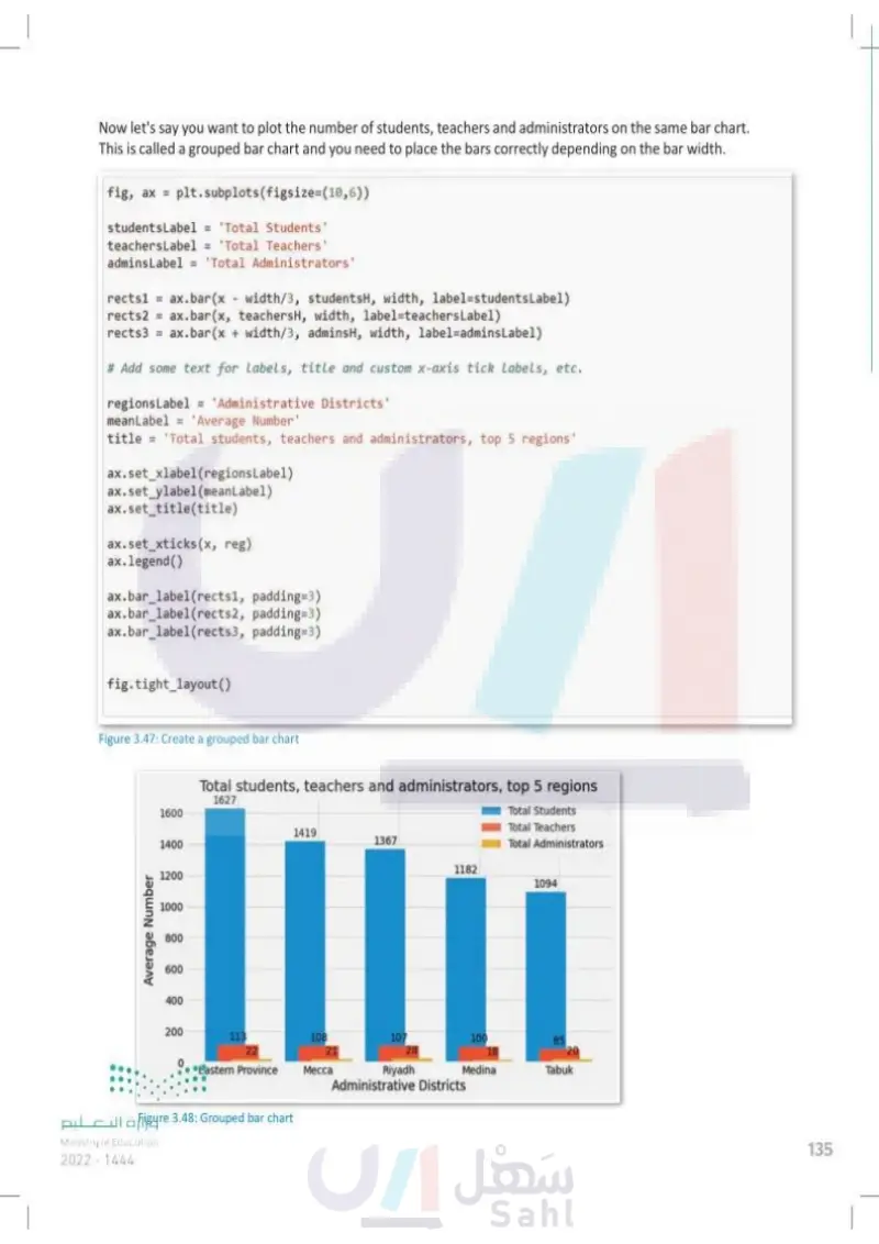
Now let's say you want to plot the number of students, teachers and administrators on the same bar chart. This is called a grouped bar chart and you need to place the bars correctly depending on the bar width. fig, ax = plt.subplots (figsize=(10,6)) studentsLabel = 'Total Students' teachersLabel = 'Total Teachers' admins Label = 'Total Administrators' rects1 = ax.bar(x width/3, studentsH, width, label=studentsLabel) rects2 ax.bar(x, teachersH, width, label-teachersLabel) rects3 = ax.bar(x + width/3, adminsH, width, label=admins Label) # Add some text for Labels, title and custom x-axis tick labels, etc. regions Label = 'Administrative Districts' meanLabel='Average Number title='Total students, teachers and administrators, top 5 regions' ax.set_xlabel(regions Label) ax.set_ylabel(meanLabel) ax.set_title(title) ax.set_xticks(x, reg) ax.legend() ax.bar_label(rects1, padding=3) ax.bar_label(rects2, padding=3) ax.bar_label(rects3, padding=3) fig.tight_layout() Average Number وزارة التعليم Ministry of Education 2024-1446 1600 1400 1200 1000 800 600 400 Figure 3.47: Create a grouped bar chart Total students, teachers and administrators, top 5 regions 1627 1419 1367 1182 Total Students Total Teachers Total Administrators 1094 200 113 22 108 21 107 28 100 85 18 20 Eastern Province Mecca Riyadh Medina Tabuk Administrative Districts Figure 3.48: Grouped bar chart 135

Grouped bar chart
Now let's say you want to plot the number of students, teachers and administrators on the same bar chart. This is called a grouped bar chart and you need to place the bars correctly depending
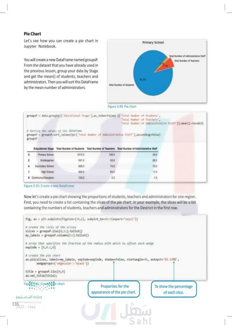
Pie Chart Let's see how you can create a pie chart in Jupyter Notebook. You will create a new DataFrame named groupsP. From the dataset that you have already used in the previous lesson, group your data by Stage and get the mean() of students, teachers and administrators. Then you will sort this DataFrame by the mean number of administrators. Primary School 91.2% Total Number of Students Total Number of Administrative Staff Total Number of Teachers 1.7% 7.1% Figure 3.49: Pie chart groupsP = data.groupby([ 'Educational Stage'], as_index=False) [['Total Number of Students', Total Number of Teachers', 'Total Number of Administrative Staff']].mean().round(0) # Sorting the values of the DataFrame groupsP = groupsP.sort_values(by=['Total Number of Administrative Staff'], ascending=False) groupsP Educational Stage Total Number of Students Total Number of Teachers Total Number of Administrative Staff Primary School 3 1915.0 2 Kindergarten 587.0 4 Secondary School 899.0 1 High School 969.0 0 Continuing Education 123.0 149.0 53.0 74.0 83.0 0.0 35.0 26.0 15.0 11.0 1.0 Figure 3.50: Create a new DataFrame Now let's create a pie chart showing the proportions of students, teachers and administrators for one region. First, you need to create a list containing the slices of the pie chart. In your example, the slices will be a list containing the numbers of students, teachers and administrators for the district in the first row. fig, ax = plt.subplots (figsize=(10,6), subplot_kw-dict (aspect="equal")) # create the Lists of the slices slices groups P.iloc[0,1:].tolist() my_labels groupsP.columns [1:].tolist() # array that specifies the fraction of the radius with which to offset each wedge explode [0,0.1,0] # create the pie chart ax.pie(slices, labels=my_labels, explode explode, shadow=False, startangle 45, autopct="%1.1f', wedgeprops={'edgecolor': 'black'}) title groupsP.iloc[0,0] ax.set_title(title); Figure 3.51: Create a pie chart وزارة التعليم Ministry of Education 136 2024-1446 Properties for the appearance of the pie chart. To show the percentage of each slice.

Create a pie chart
Create a new DataFrame
Pie Chart
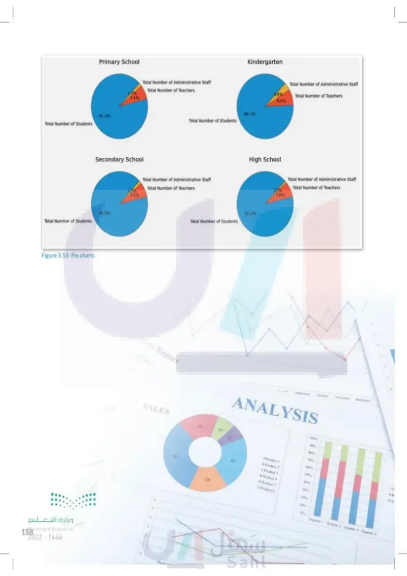
Now you will create a figure with more than one pie chart. fig, ([ax1, ax2], [ax3, ax4]) = plt.subplots (2,2, figsize-(16,10), subplot_kw-dict(aspect="equal")) # First pie chart slices groupsP.iloc[0,1:].tolist() my_labels groupsP.columns [1:].tolist() ax1.pie(slices, labels-my_labels, shadow-False, startangle-45, autopct=%1.1f%%', wedgeprops-{'edgecolor': 'black'}) title1 groupsP.iloc[0,0] = ax1.set_title(title1) # Second pie chart slices groupsP.iloc[1,1:].tolist() my_labels groupsP.columns [1:].tolist(). ax2.pie(slices, labels-my_labels, shadow-False, startangle-45, autopct='%1.1f%%', wedgeprops-{'edgecolor': 'black"}) title2 groupsP.iloc[1,0] ax2.set_title(title2) # Third pie chart slices groupsP.iloc[2,1:].tolist() my_labels groupsP.columns [1:].tolist() ax3.pie(slices, labels-my_labels, shadow-False, startangle-45, autopct-'%1.1f%%', wedgeprops-{'edgecolor': 'black')) title3 groupsP.iloc[2,0] ax3.set_title(title3) # Fourth pie chart slices groupsP.iloc[3,1:].tolist() my_labels groupsP.columns [1:].tolist() ax4.pie(slices, labels-my_labels, shadow-False, startangle-45, autopct='%1.1fX%', wedgeprops={'edgecolor': 'black'}) title4 groupsP.iloc[3,0] ax4.set_title(title4); وزارة التعليم Ministry of Education 2024-1446 Figure 3.52: Create four pie charts Matplotlib library has a large collection of settings to edit the style of a chart or graph. You can visit the online documentation of the library for details on each specific setting at https://matplotlib.org. 137

Matplotlib library has a large collection of settings to edit the style of a chart or graph. You can visit the online documentation of the library for details on each specific setting at http
Now you will create a figure with more than one pie chart
Primary School Total Number of Students 91.2% Total Number of Administrative Staff Total Number of Teachers 1.7% 7.1% Secondary School 91.0% Total Number of Students وزارة التعليم Ministry of Education 138 2024-1446 Kindergarten 88.1% Total Number of Students Total Number of Administrative Staff 1.5% Total Number of Teachers 7.5% Total Number of Administrative Staff 3.9% Total Number of Teachers 8.0% High School 91.2% Total Number of Students Figure 3.53: Pie charts Report SALES Prod 2 14 Total Number of Administrative Staff Total Number of Teachers 1.0% 7.8% September October November December ANALYSIS 2 100% 90% 80% 7096 Product I 60% Product 2 50% Product 3 40% Product 4 30% Product 5 Product 6 20% 10% 0% Quarter 1 Quarter 2 Quarter 3 Quarter 4 C B A

Pie charts
C B A Exercises 1 Discuss the importance of data visualization as a stage in exploratory data analysis. Illustrate its importance with two examples. 2 Compare the main characteristics of line and bar charts. Find two examples of datasets and select the most appropriate chart for each one. 3 Identify the main difference between the scatter plot and the other charts. Give an example of the use of a scatter plot. وزارة التعليم Ministry of Education 2024-1446 139

Identify the main difference between the scatter plot and the other charts. Give an example of the use of a scatter plot
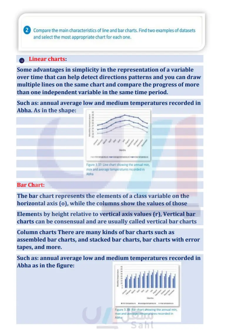
Compare the main characteristics of line and bar charts. Find two examples of datasets and select the most appropriate chart for each one
Discuss the importance of data visualization as a stage in exploratory data analysis. Illustrate its importance with two examples
4 Name some Python libraries that can be used for applying data visualization techniques. What must you do to start using them in Jupyter Notebook? 5 You want to figure out how many tourists are visiting KSA per month for one region in the dataset. > What kind of chart would be the most appropriate to use? (Justify your answer.) > Choose any region from the dataset and, using the Matplotlib library, create the kind of chart you think is the most appropriate. > Based on the chart you created, figure out which month had the most visitors for the region you chose. 6 You want to compare the number of tourists visiting KSA from 3 parts of the world, Europe, Asia, and the Middle East, for the months of October to January. > What kind of chart would be the most appropriate to use? (Justify your answer.) > Create the kind of chart you think is the most appropriate. > Based on the chart you created, figure out for every month from October to January which part of the world the most tourists came from. وزارة التعليم Ministry of Education 140 2024-1446

You want to compare the number of tourists visiting KSA from 3 parts of the world, Europe, Asia, and the Middle East, for the months of October to January
You want to figure out how many tourists are visiting KSA per month for one region in the dataset
Name some Python libraries that can be used for applying data visualization techniques. What must you do to start using them in Jupyter Notebook
7 You want to find out the month with the most visitors and then figure out the percentage of visitors to each region for this month. > Create a DataFrame to determine which month has the greatest number of visitors. > What kind of chart would be the most appropriate in this case? Justify your answer. > Create the kind of chart you think is the most appropriate. > Based on the chart you created, which region has the highest percentage of visitors and which one has the lowest percentage of visitors? وزارة التعليم Ministry of Education 2024-1446 141

You want to find out the month with the most visitors and then figure out the percentage of visitors to each region for this month